Wishes

Posted on

image

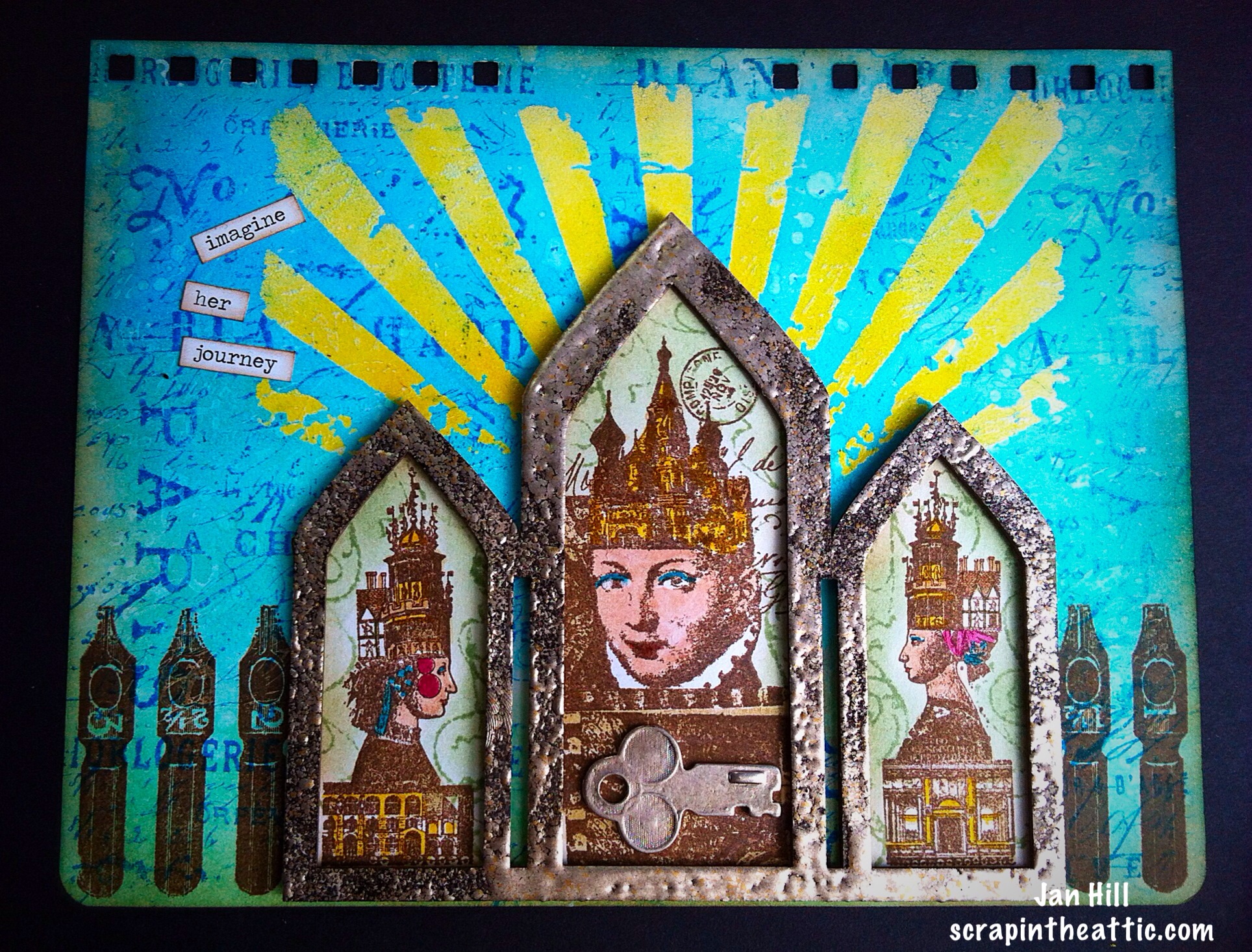
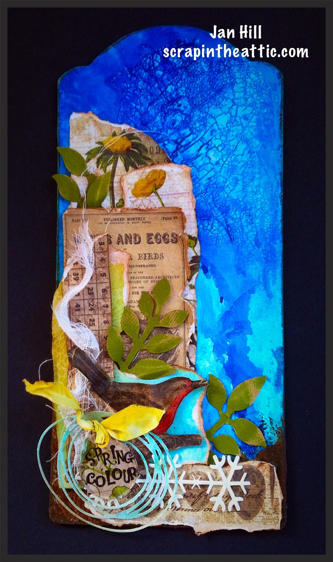
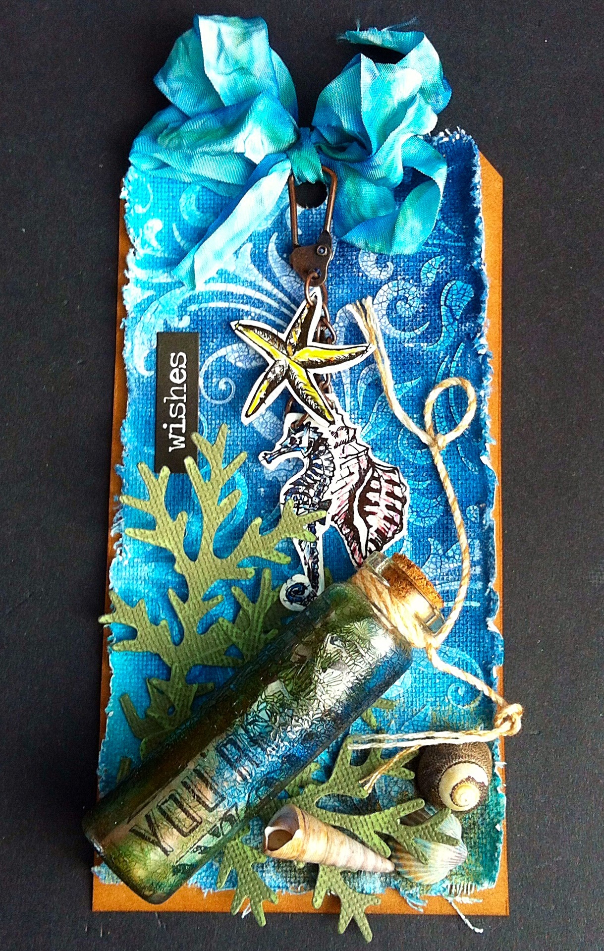
I wanted to make an special card for a friend’s birthday. When I saw the challenge at Linda Ledbetter blog it was my inspiration. I love the faux glass technique created by Tim Holtz in his book, The Compendium Of Curiosities 3. There are some amazing prizes from Tim and Mario plus Funkie Junkie are the sponsors this month.

I decided to have a message in a bottle at the bottom of the sea. (Now I have the Police song going round in my head!)

image

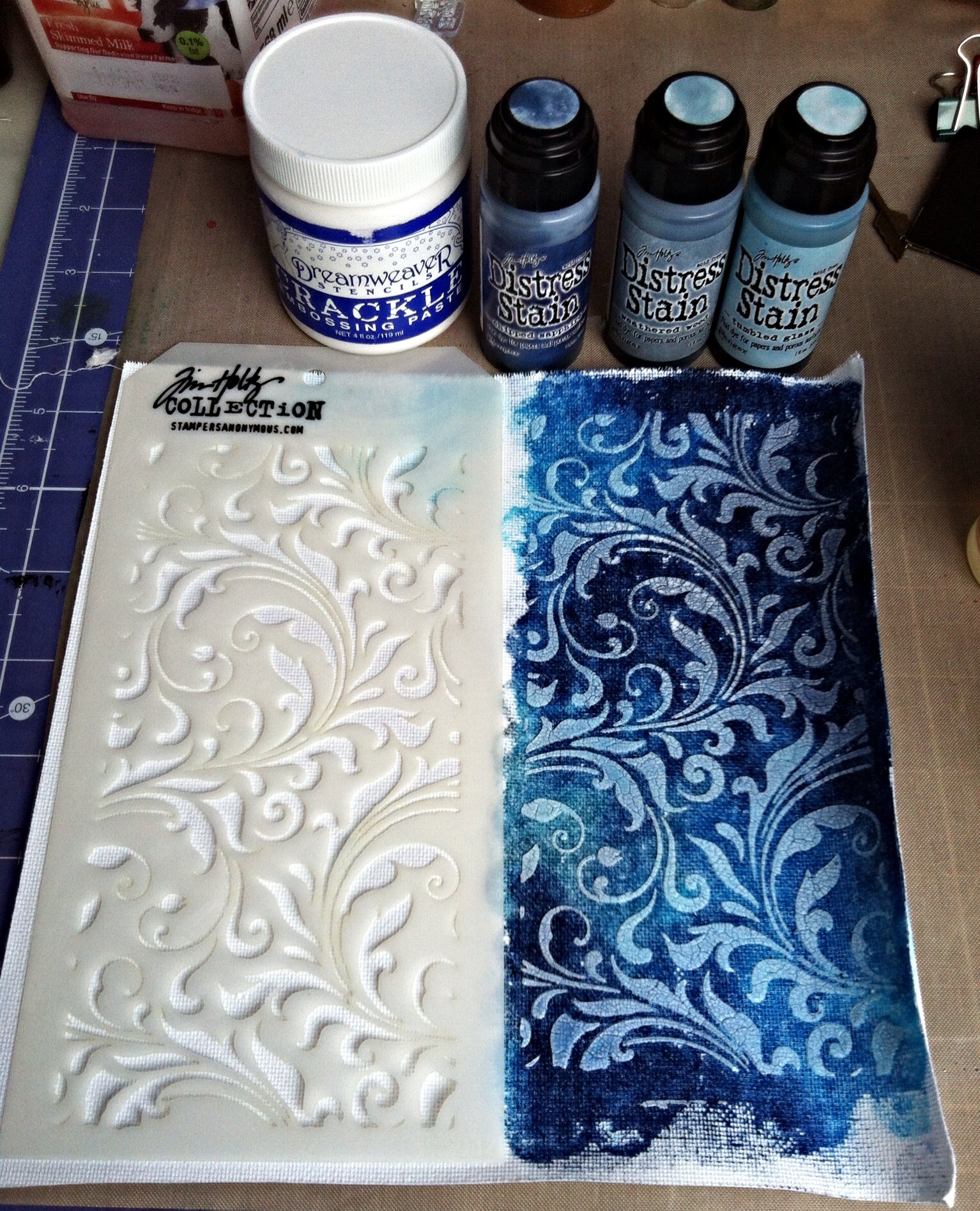
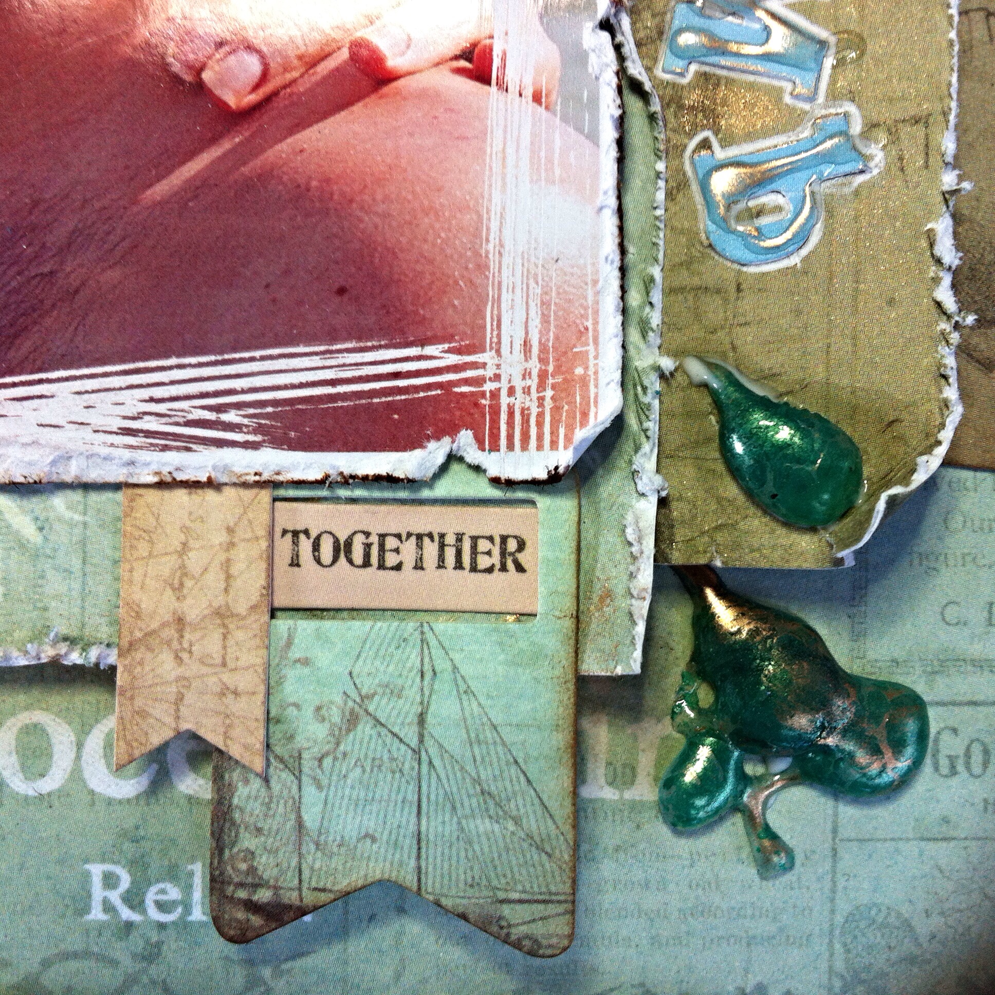
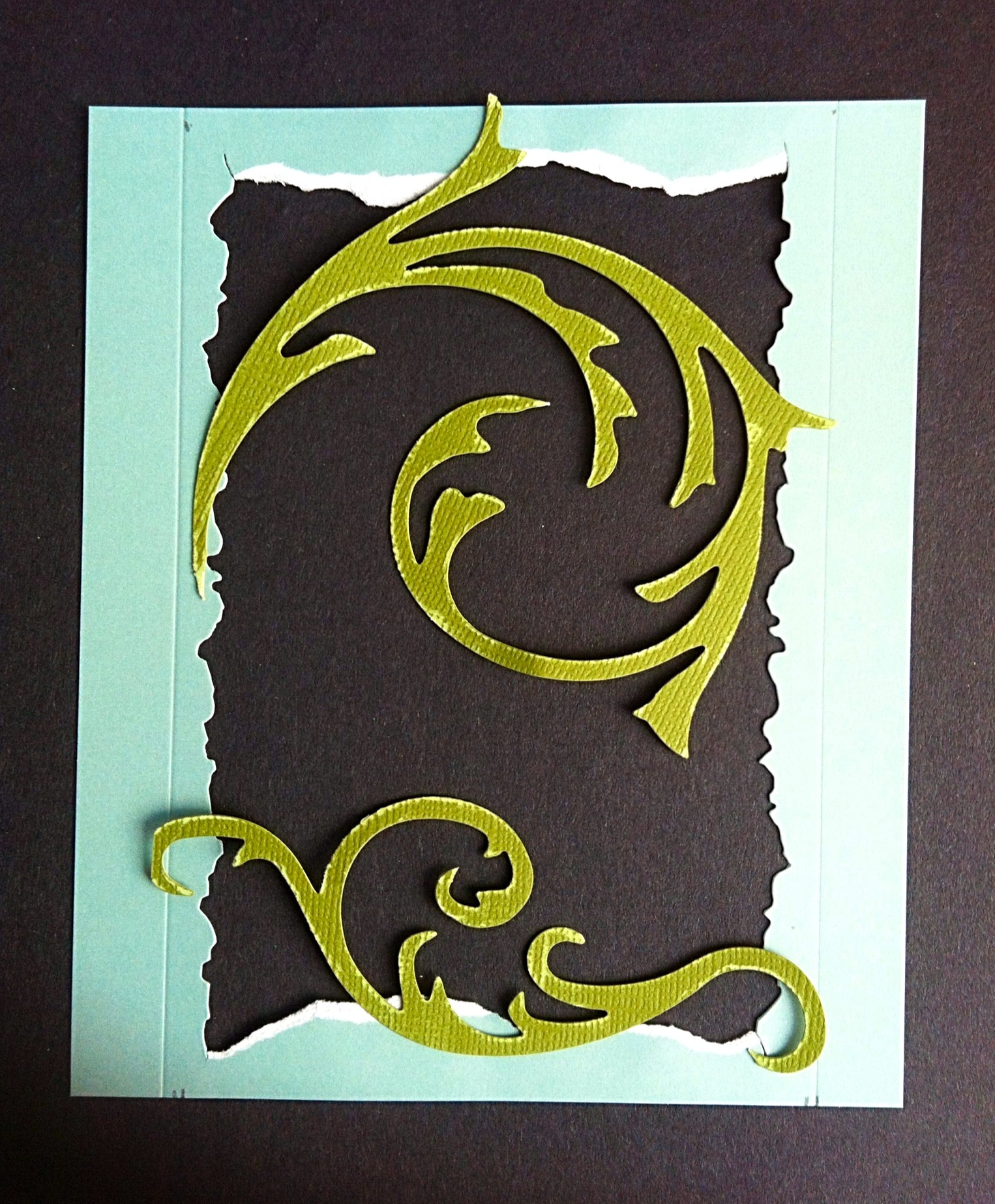
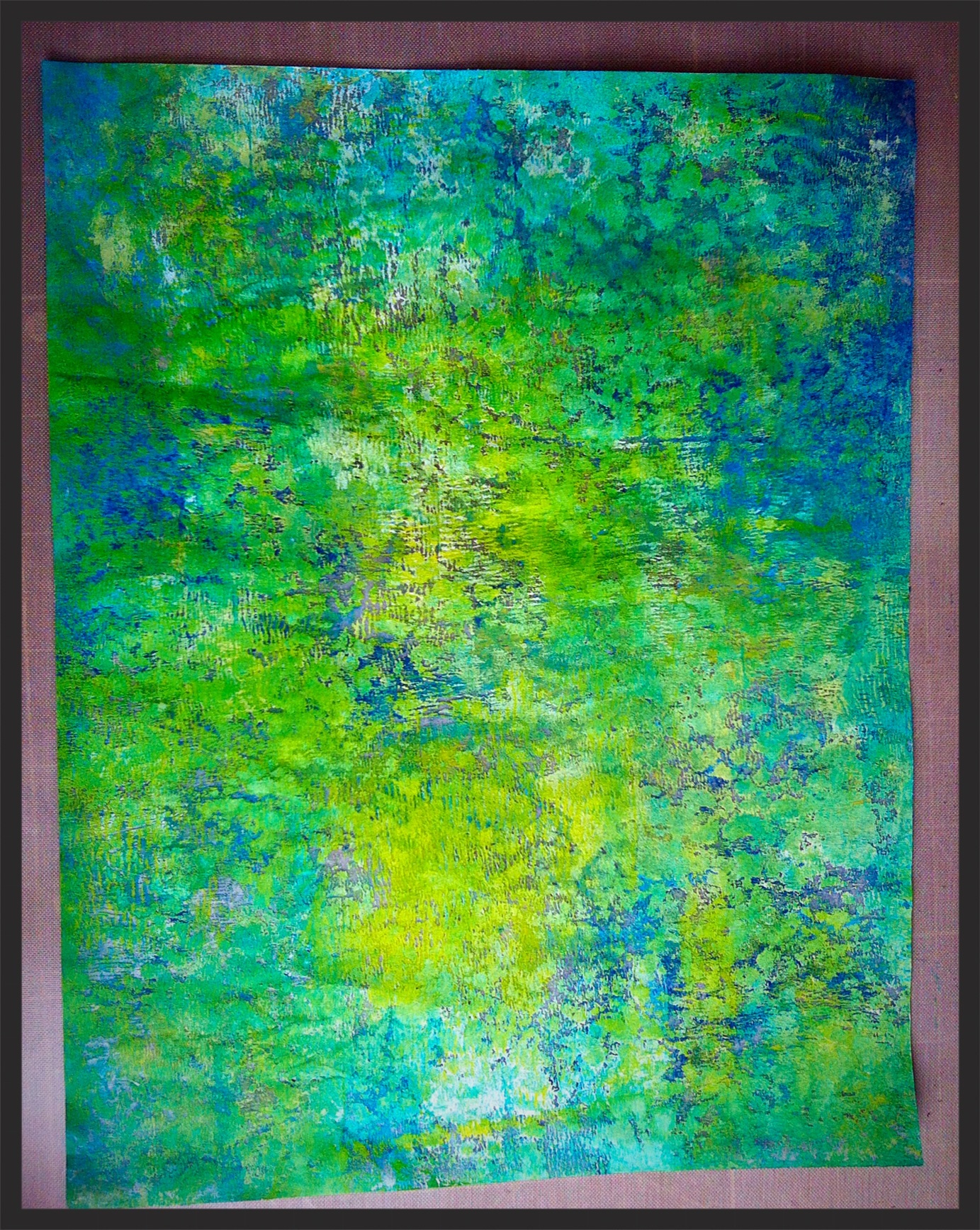
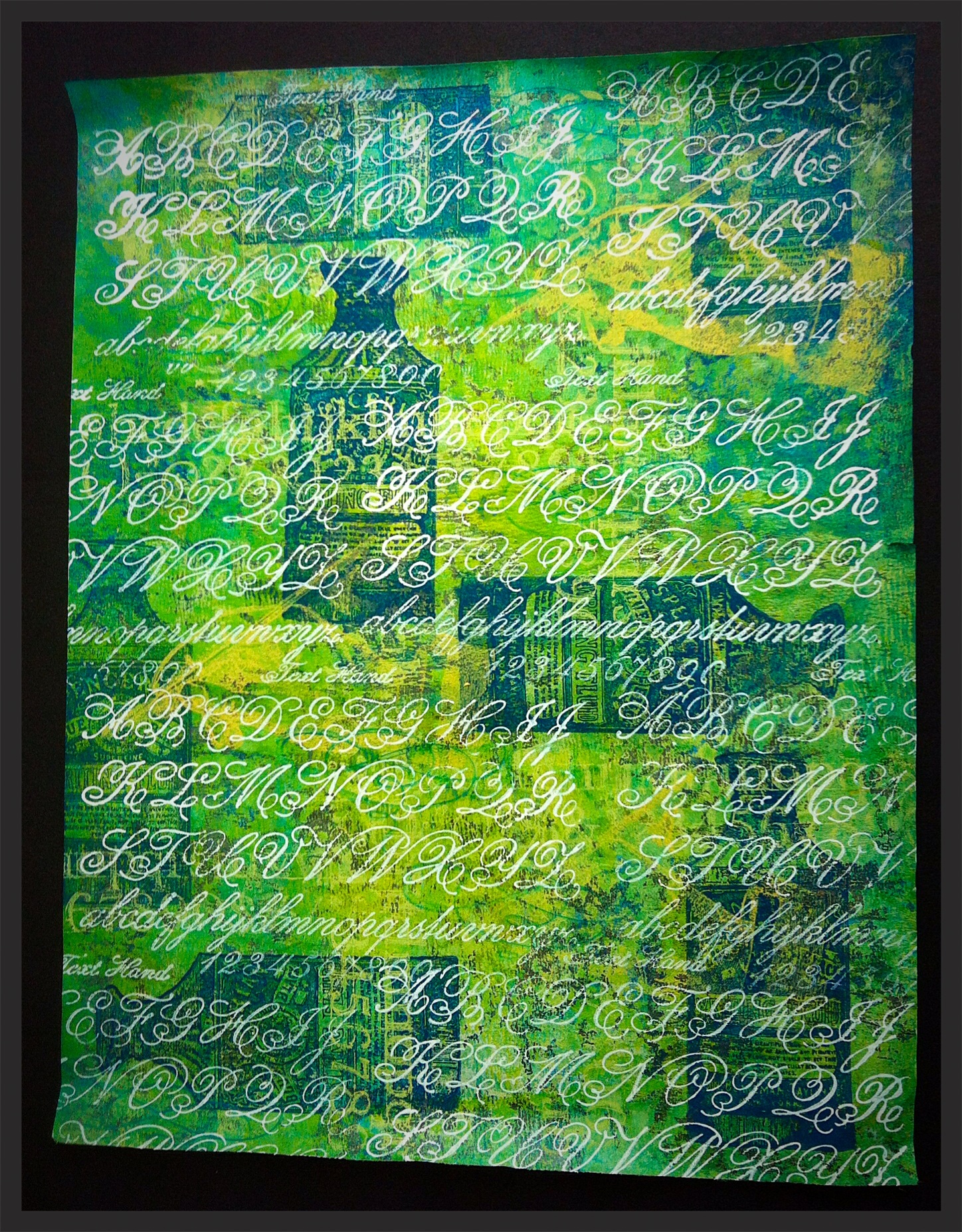
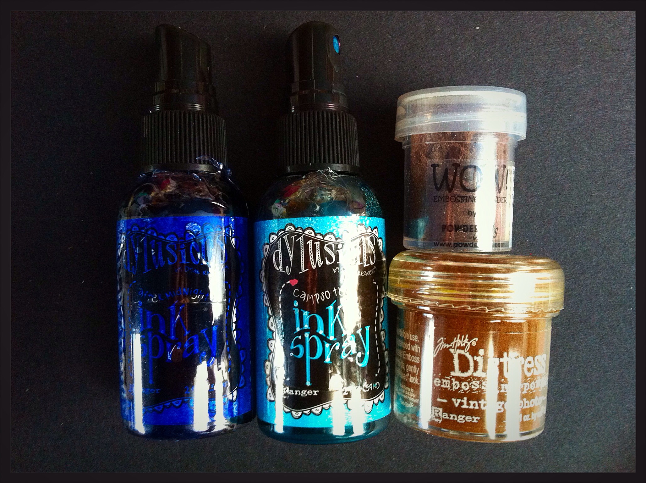
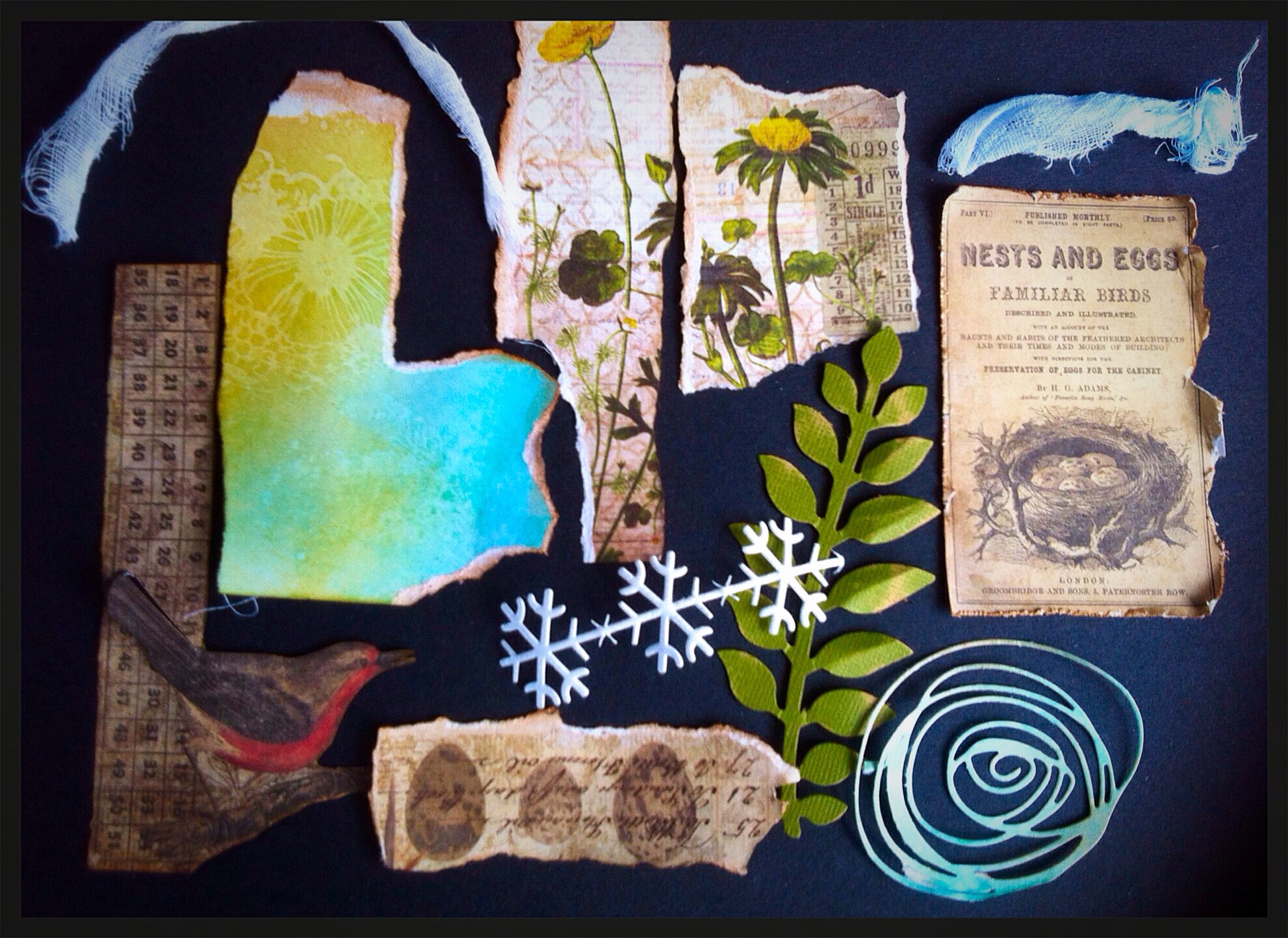
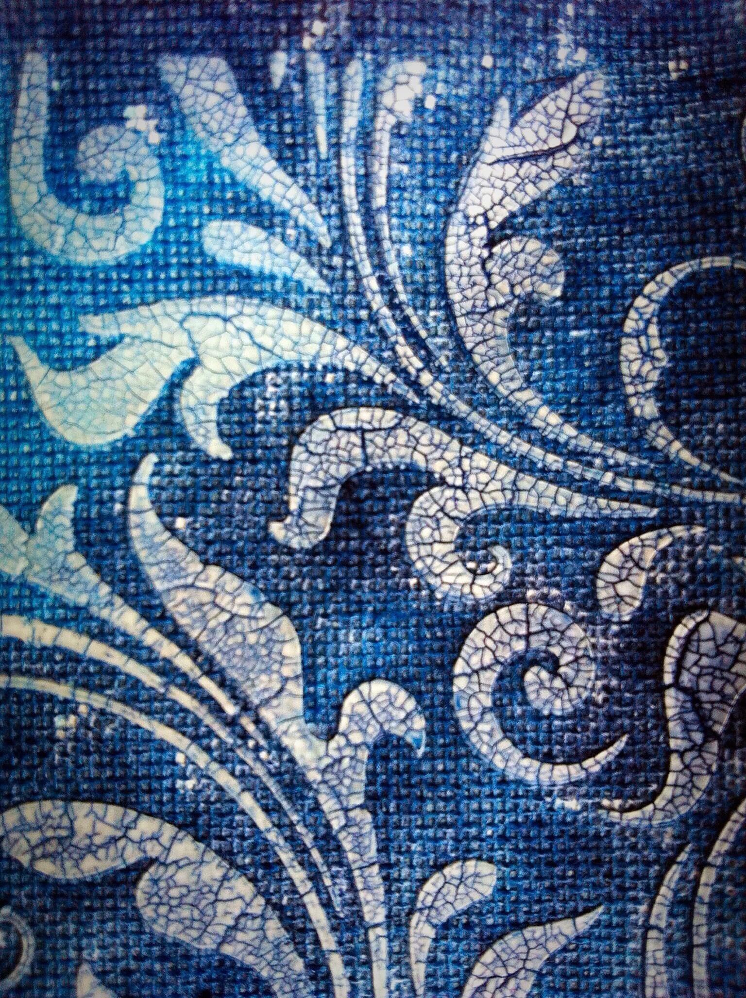
I used some canvas paper and used crackle paste with my new favourite stencil, flourishes. It didn’t look much until I used different Distress Stains and inks and then the crackles really showed up. Brenda Brown used this technique on a canvas I and I loved it so thought I would incorporate the idea. I die cut a tag and scuffed the edges of the canvas.

image

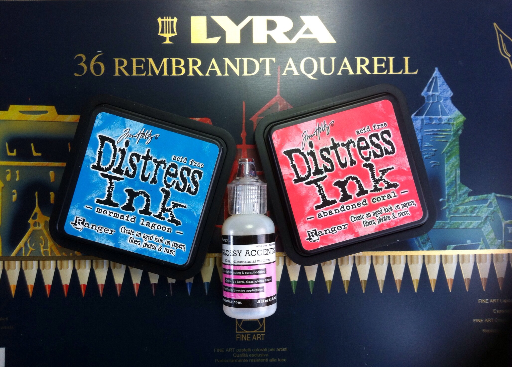
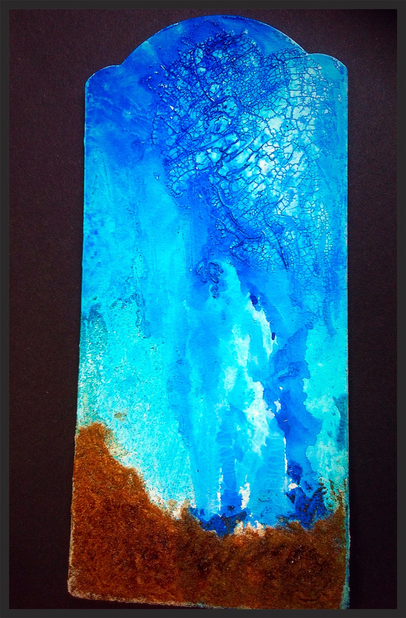
I used Tim’s technique to create the faux glass effect on my bottle. You will need your own copy of his book to find the instructions. I used various colours of alcohol ink and then dripped blending solution on top to drive colours into the cracks. I was pleased with how it turned out because I wanted it to look as if algae was growing around the bottle.

image

The message to go inside was a TH stamp, I used Black Archival ink and then tore it out, scrumpled it up then inked with DI Vintage and Pumice Stone. The note went into the bottle and got corked inside.

image

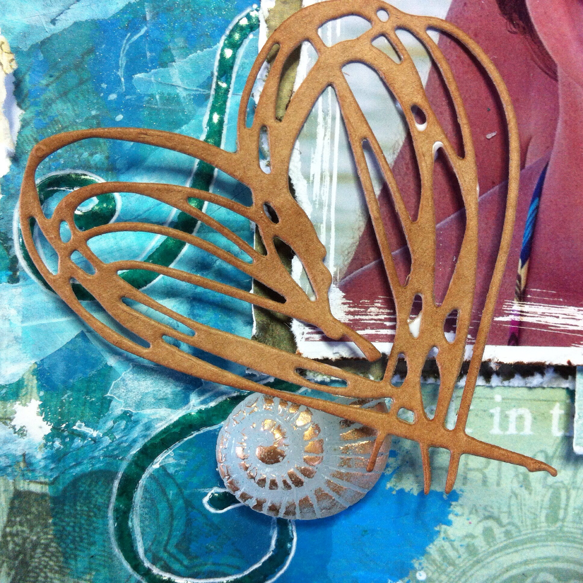
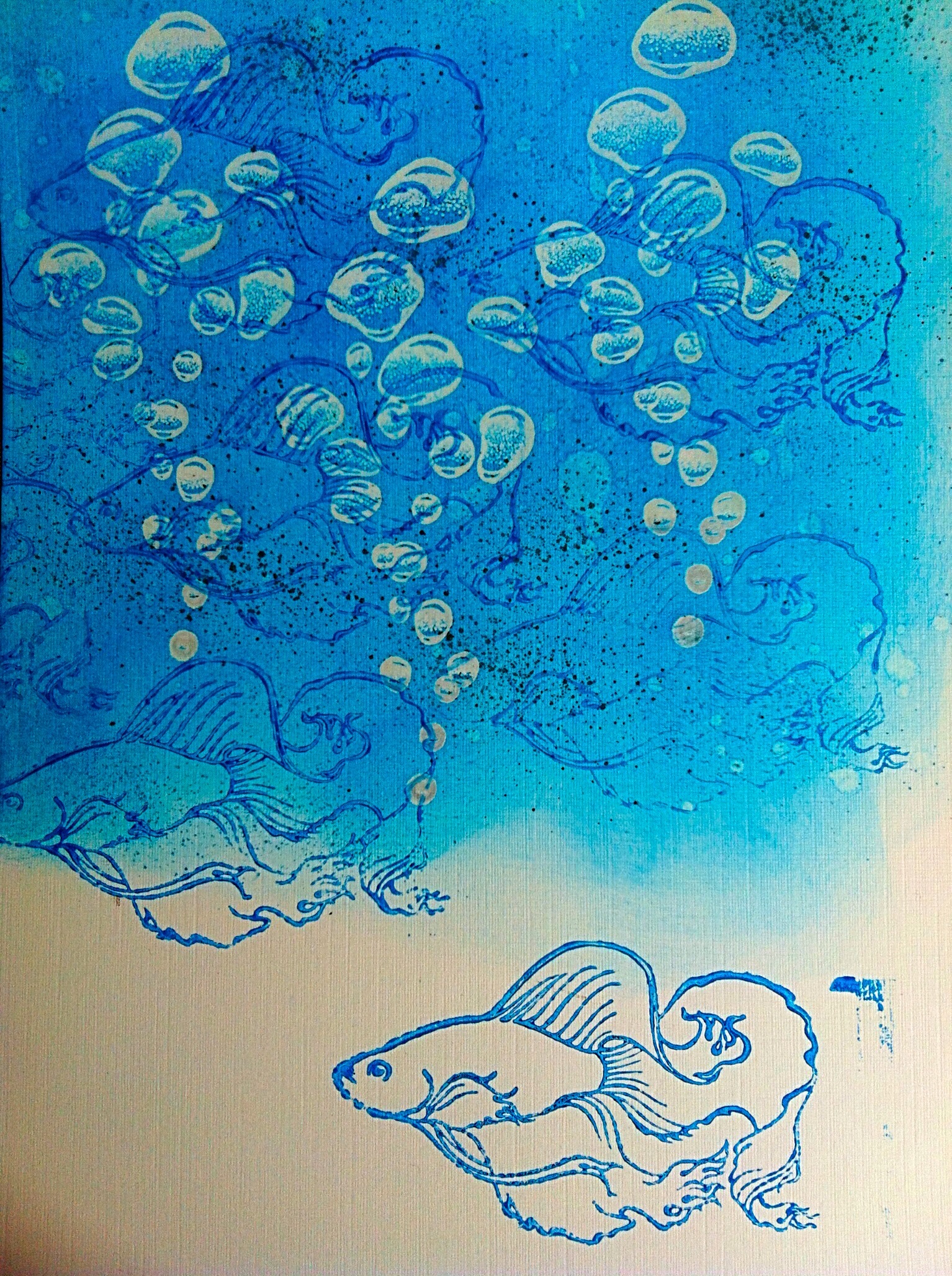
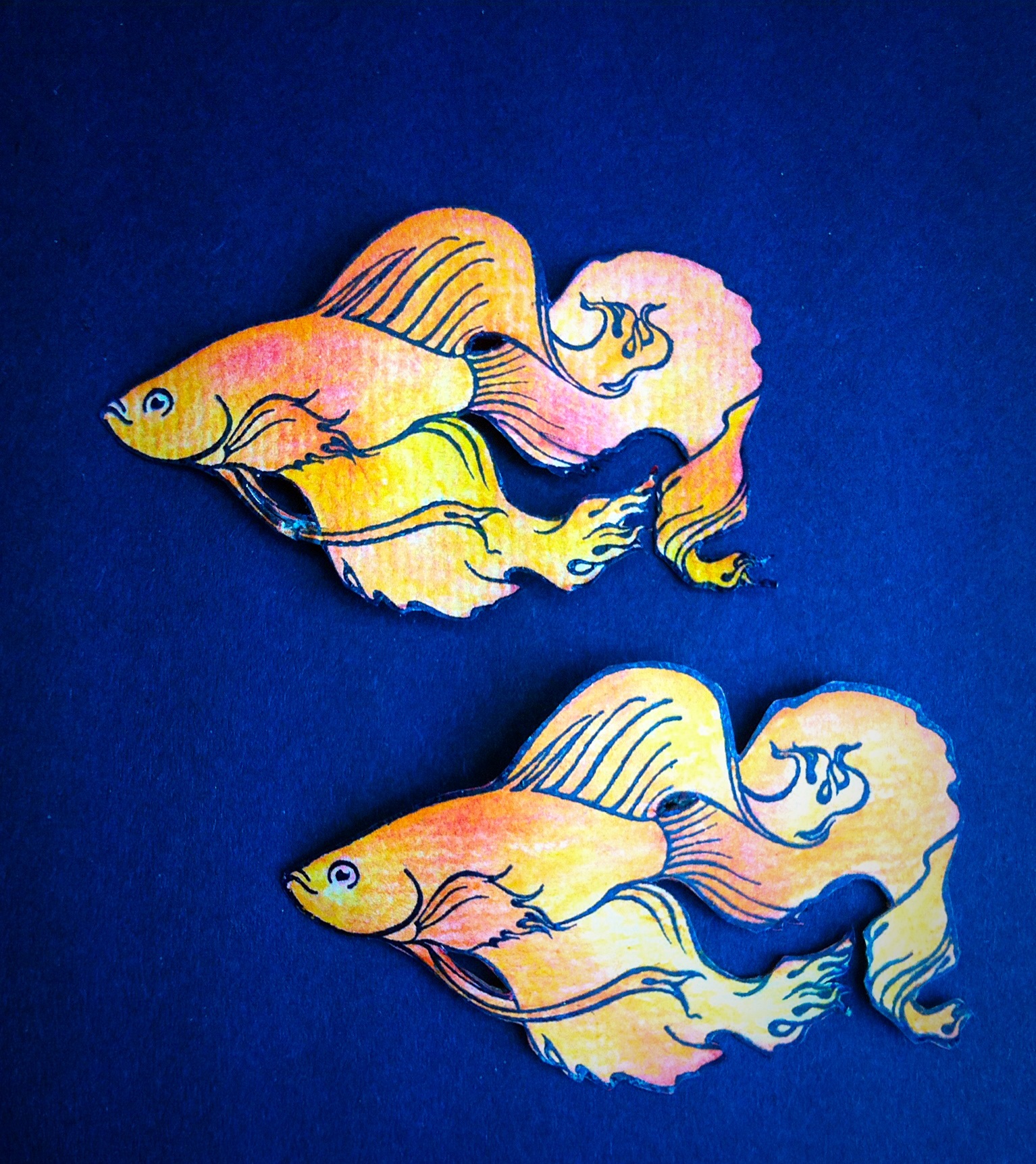
I wanted some sea creatures and tried various options of embossing, inking the stamps but nothing looked right! So decided to use Shrink Plastic. I stamped with archival onto white, then coloured with aqua pencil crayons before heating. You can see how much they changed size as the sea horse has yet to be shrunk.

image

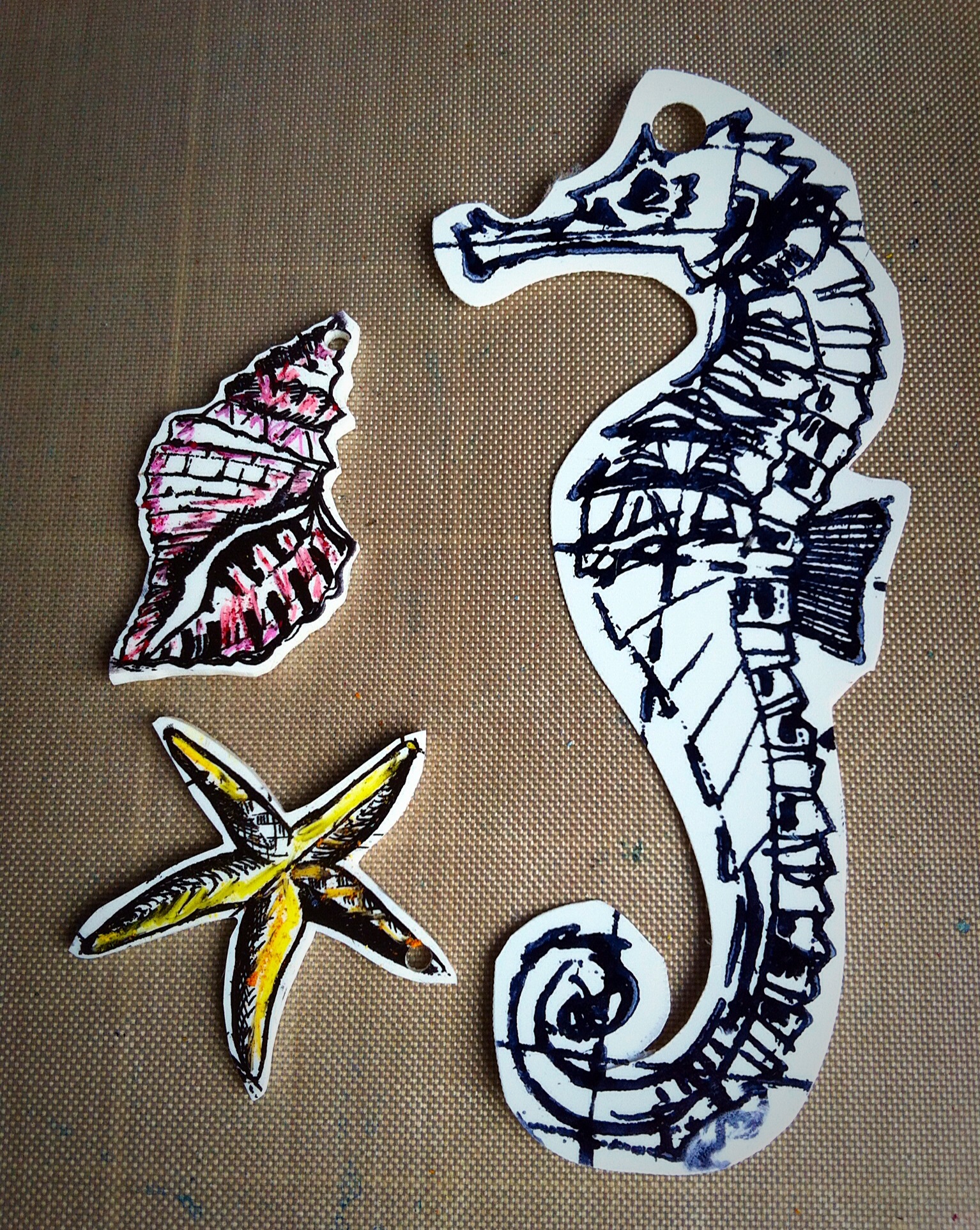
I clipped them onto a swivel chain at different heights, don’t forget to punch a hole before you shrink!
I added some seaweed, die cut using Tattered Pinecone leaves from coordinations paper which I sanded.

image

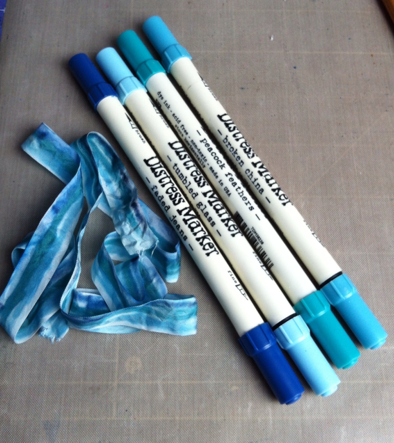
The ribbon was the finishing touch. I used Distress markers to colour stripes, sprayed water then dried with a heat gun. I think I saw Tammy Tutterow use this technique on her blog.

image

I tied some twine around the bottle neck, glued on some shells and added a Big Chat sticker. I hope my friend with enjoy finding the message!

I am also entering the tag into the Celebrations challenge at A Vintage Journey blog. I was inspired by the faux glass technique and have used mainly Tim Holtz products, stamps, inks, stains and embellishments.

Wish me luck!

Hugs
Jan x


Steampunk Shadowbox

Posted on

image

Welcome to our June Challenge at The Mirror Crack’d.

Our theme for this month is to create a Shadow Box.

Our host is the talented Shilpa, and she will be choosing our Winner and Top 5.

We are thrilled to be sponsored by………

image
With a prize of £12.00 to spend at your favourite Woodware Stockist, either in store or on line.

Woodware are a Yorkshire based family owned business, as well as distributing Dreamweaver Stencils and Stampendous Stamps we have a wonderful range of stamps designed for us by Francoise Read and Jane Gill. They also scour the world for new and innovative products for the crafty card maker, and have a great range of punches and tools of the trade, to find stockists in your area or to see the range visit the website www.woodware.co.uk.

I began the shadow box with a reversed canvas which I painted black.image

Then the fun began! I used Grunge Paste, Deco art Textured sand paste and embedded all sorts of collected bits and pieces. I had some Tim Holltz cogs, Prima Mechanicals, bottle tops and bits from my friends garage floor. I also glued on tiny glass beads.

image

The metal was dabbed with white and green paint and distressed or painted black. Then the Treasure Gold gilding wax came out, it highlighted all the different textures.


image

I cut a piece of smooth card to fit the recess then randomly stamped Tim Holtz Steampunk set in black archival ink and clear heat embossed over the top before the ink dried. I stamped the men on a separate sheet and fussy cut them out. The background was Distress Inked using Peacock Feathers, Salty Ocean and Mustard Seed. I added torn tissue tape to create some more texture on the background. The men were distressed with Vintage Photoand raised on foam squares. The die cut cogs were embossed with Vintage Photo Distress embossing powder and then tucked under the frame. I added some metal cogs to enhance the industrial feel.

image


I really enjoy making shadow boxes and love the 3D effects using texture pastes and embellishments. I hope you have been inspired to have a go, I am looking forward to seeing your entry!

I am entering the Ravages of Time challenge over at SanDee and Amelie’s blog, some luscious prizes to be won!
Hugs

Jan x


What makes you smile?

Posted on

Welcome to my first time as Challenge Host at Our Creative Corner!

This is my challenge :

Close your eyes for a few minutes, relax and think about something that makes you smile…………..
It could be a special person, a favourite place, a quote, an incident, the list is endless!

Your June challenge is to create something that will make us smile, it could be a scrapbook or journal page, a canvas, a tag, whatever your imagination dictates.

I am intrigued to see what you might make and look forward to viewing your creations.

 This is what makes me smile. We were on a family holiday in Spain visiting Bis Abuala in Santiago de la Ribera. It was my Granddaughters first trip and lots of photos were taken. I was just about to snap the shutter when my husband photo bombed. The photo always makes me smile as it was such a happy time.

I decided to create a scrapbook page.

image


I began with some Prima Seashore papers. I wanted to create the movement of the water so swirled and spread the paint across with an old credit card. I used a selection of chalky paints, some opaque and some translucent to create depth and layers. Later I drew swirls with an embossing ink pen and heated jewelled enamel to made wave like flourishes.
image

The photo was scratched and distressed with a Prima tool.
image

I needed some shells and sea glass as embellishments. I used hot glue in cake decorating moulds for the shells. The sea glass was blobs of hot glue covered in the enamel and heated with a heat gun to a smooth finish. I really liked the look! They were all given the Treasure Gold treatment with Renaissance.
image

The large letters were frosted plastic I found in my stash. They were painted on the back with the same paints I used for the sea and had Treasure Gold on the front. The small letters were with the Prima Seashore collection, outlined in white pen then highlighted with glossy accents.
image

I added a TH Thinlets heart die cut from Kraft card, two tags cut from the same papers and small banners with TH “Together” small talk sticker.
image


When I put the page together the sea was too straight so I added some Mermaid Lagoon DI ( such a great name) and a few splashes of white. I outlined the letters and tags with white pen.

The Design Team have created some great inspiration for you, please visit their blogs and leave them  your thoughts.

Our sponsor this month is Tando Creative, their chipboard is legendary for crafters! I hope you win a prize for your creation.

Good Luck and happy crafting

Hugs

Jan x


Sponsor Spotlight- Designs by Ryn

Posted on

I am delighted to highlight our sponsor at Our Creative Corner, Ryn. Her stamps are beautifully detailed and stamp perfectly every time. I chose the bubbles and fish stamps to use.

image

image

I decided to create a diorama card, for the fish to swim amongst sea weed and coral. It was very fiddly because it was my first attempt.

This is how I made the card.

The background was stamped, embossed and inked.

The background was stamped, embossed and inked.

The second layer, using coordinations paper.

The second layer, using coordinations paper.

I stamped the fish on watercolour paper and cut them out.

I stamped the fish on watercolour paper and cut them out.

I coloured them and added fussy cut layer fins and tail to the front fish.

I coloured them and added fussy cut layer to the front fish.

I scored and folded the sides of the card and then added the layers with slots at the side.

I scored and folded the sides of the card and then added the layers with slots at the side.

The three pieces were layered with double sided tape.

The three pieces were layered with double sided tape to the folded sides.

The top layer was die cut with TH thinlets to resemble coral.

The top layer was die cut with TH thinlets to resemble coral.

I stamped some oriental text on the top layer and added Rock Candy Stickles to the coral.

I stamped some oriental text on the top layer and added Rock Candy Stickles to the coral.

I was really pleased with how the card turned out, I hope you will be inspired try Ryn’s stamps, they are beautiful to use.

Hugs
Jan x


Tryptich The Mirror Crack’d Challenge

Posted on

image

Welcome to our May Challenge at The Mirror Crack’d. Our theme for the month is a Triptych.
A triptych is a work of art that is divided into three sections, or three carved panels that are hinged together and can be folded shut or displayed open.
Our host is Rita Marie, and she will be choosing our Winner and Top 5. Instead of a physical prize this month we would like to offer our Winner a Guest Designer spot for a future challenge.
 We hope our fabulous Design Team can inspire you. Please pop by their blogs and show them your appreciation


I was inspired by the eclipse of the sun on March 20th! I had no idea what was going to happen on this journal page when the sun ray stencil just seemed to be the right thing. I had watched a programme on TV about the ancient legends surrounding the eclipse, the Vikings, Hindus and Pagans believed that the sun was eaten by their Gods or creatures sent to eat it by Gods. When I remembered a stamp set by Lyn Perella in my stash I imagined the lady with the secret smile was a sun eater! The two other ladies are watching the eclipse from their homes.
Soooo….

image I began by inking the suns rays from a TH stencil on to my art journal page. ( Now on page 2 so I am getting adventurous!) I clear embossed over the yellow to create a resist for the next layers in the design.image


I love over the inking part, blending the colours together to create the sky. I used Tim’s spritz and flick water technique to add depth.
image


I stamped one of my favourite background text stamps for more interest.

Then came the ladies, The Sun Eater and the two Observers. They were stamped and coloured. I cut the niche size from stamping card and filled the space. I coloured them with Distress Markers.

The Tryptich was from a Tando set. I embossed with a mixture of UTEE colours from Frantage. I used Tarnished Silver, black and smudges of gold. I wanted a distressed, tarnished look, rather than smooth on the frame. I stamped a series of pen nibs because the Observers will write their thoughts in their journals. The Sun Eater plays a key role in the eclipse so I added a key to her niche. I finally added some small talk words from Tim Holtz to finish the page.

I hope you enjoyed my take on the event! We hope our fabulous Design Team can inspire you. Please pop by their blogs and show them your appreciation. Please check out all the DT work at The Mirror Crack’d, I hope you will be inspired to enter the challenge.

Please leave me a comment, I do appreciate it,

Hugs

Jan x


April Showers Bring May Flowers

Posted on


image

Shari is the host for this months challenge at Our Creative Corner. This is her fun theme……

April Showers bring May Flowers

…Or so the proverb goes.  Spring comes late in my neck of the world, in the mountains of Northern Idaho.  In the month of May (with Summer just weeks away), our Spring flowers are still, usually, under a thin blanket of snow, until those Spring rains wash it all away.

This month, the challenge is to create something, a mixed-media project, a journal page, a scrapbook page, a card or tag…Anything, that reflects the Spring rains and/or Spring flowers in your part of the world.Now, I’m not going to nit-pic your choices of Spring flowers, as the growing season here where I live is short and our Spring flowers don’t last very long before the blooms of Summer start budding.  So, if you throw in flowers of Summer into your creation, that’s OK, too.

The DT have come up with some inspiring creations for you! Check them out at Our Creative Corner.

imageI decided to “Have a go” at my Art Journal! It has been gathering dust on the shelf, so I bit the bullet and started to first page. I enjoyed myself with Dylusions sprays, stamps and inks, a very messy affair indeed. I used Tim’s spritz and flick technique to get the raindrops and blue shades for the May skies.

I rescued an old book and tore up some pages to stick on before spraying and inking the page. I wanted a spring like feel rather than a grey rainy day.


I stamped generic flowers shapes on top, a JOFY set and some unbranded from my stash. I stamped the JOFY flowers on a piece of watercolour paper then coloured them with Distress Markers. I fussy cut the flower heads and stuck them over the stamped images. I added a few silver skeleton leaves for texture.

image


image

I love the JOFY stamp, “Don’t eat the daisies” because last Spring my baby Granddaughter always ate the daisies in the lawn. I stamped the sentiment as a border and heat embossed with white opaque powder. I like the contrast with the blue background.

Now for the zany Dylusions character! I stamped and coloured her, plus her umbrella with Distress Markers. I am not a fan of colouring in but it was quite therapeutic.

I added Ryn’s water drips at the top, they are just so detailed and as she is our sponsor this month it seemed fitting. The title was hand written on shiny paper and then positioned onto the sky. Phew! Finished!

My first step into Art Journalling was not as scary as I had thought! I hope it inspires you to have a go. There are some great prizes on offer from Ryn too!

Designs by Ryn

image


I hope you have fun with the challenge and enjoy yourself! Please leave me a comment, I like to know what you think about my creations.

Hugs Jan x


Roses and friends

Posted on

image

Wow, had a great weekend! Scrapped with friends on Friday then visited Daisy and Jewels in Exhall on Saturday.
We watched some interesting demos from Pauline Wheeler and Hels Sheridan.

I have always loved Hels roses and she did a demo of how to make them in detail. It is also on her blog.

The rose on the tag is made from the demo, second attempt!
Thanks Hels, I wanted to enter your Sunday Stampers as the butterflies are friends!
Hugs
Jan x


Ruby Wedding Card

Posted on

image

I made a card for my lovely friend Carol and her husband Graham to celebrate their Ruby Wedding Anniversay, Congratulations!

I used lots of Tim dies, thinlets, rosette, frameworks honeycomb and the word play alphabet.
I concentrated on the frameworks because I am entering the latest CC3 challenge from Linda Ledbetter. The challenge is from Tim Holtz Compendium of Curiosities Vol 3, page 64. You need to check out this book, Tim has included so many amazing techniques. There are fab prizes for this challenge from Inspiration Emporium!

I decided to try out a drop shadow effect with the frameworks. I cut out the first frame from plumbers tape and used an embossing folder, French Script. The second was cut from a backing paper from my stash.
The thinlets die cut the pattern to reveal the same paper (ruby) underneath and I used it to make the rosette.
The DI was Mahogany, Fired Brick and Victorian Velvet plus Vintage Photo. A Paperartsy stamp, embossed with silver then inked to reveal the letters finished the card off. The paper roses were added to give more dimension and happened to be the right colours!
Hugs
Jan x


Make and use a Masterboard

Posted on

Our theme for this month is to create and use a Masterboard. A masterboard is a large background piece designed to be cut up and used in smaller projects, such as journals, postcards, cards, ATC’s etc. It can be created with any combination of collage, paint, inks, sprays, rubber stamps, stencils.

Our host is Angela, and she will be choosing our Winner and Top 5.

We are thrilled to be sponsored by

WOODWARE CRAFT COLLECTION
With a prize of £12.00 to spend at your favourite Woodware Stockist, either in store or on line.

Wow this is my second DT project for The Mirror Crack’d! So exciting, I had a great welcome from the team. I was a bit nervous because previous master boards had ended up a muddy mess. However, I took some tips from Leandra at Paperartsy and used waxed tissue with Paperartsy paints. I am so pleased with the result.  The masterboard I created I used to cover a cheap notebook.

image


I started with with paint and brayered on shades of colours, opaque then translucent paints.

image

image
I brayered dark, medium and light shades of the same colour to create layers and depth. Then I used TH stamps with the same colour paints on top.

I used blues, greens  and yellow paint.

I used all the stamps in the set but finished with the white script over the whole sheet to unify the page.

The wax paper felt substantial with the layers of paint and could be sewn.

I die cut an Apothocary bottle and embossed the stamp over it then inked with blues. The splat was made with blue alcohol inks on shiny card then the shape cut from the TH new thinlets. I thought it was an amusing embellishment! I heat embossed a title with black embossing powder to complete the front.

image

I was pleased with the final board and that I had managed to get some depth and visible layers.

I hope you are inspired to join us The Mirror Crack’d for this challenge. Check out the amazing projects the DT created with their master boards.

Jan x


Colour Your World, April Challenge at OCC

Posted on


Colour Your World

This was such a lovely challenge from Laurie! Spring is such a hopeful time, the colours are bright and fresh but there is still a hint of Winter in the air.

She said:

Here in the United States we are coming into spring – the season when nature comes forth with new life.

Soft green grasses grow in the fields and the trees bloom in glorious colors with the promise of fruit.

Tulips and daffodils emerge from the soil after a long winters nap.

The colors of spring, the sights and sounds of nature at this time of the year renews my soul.

In the spring time the colors of nature are different around the world.

For my challenge this month I want you to

Color Your World

For this challenge create a project with the colors of spring time where you live.

Show us what colors renew your soul, post your creation at Our Creative Corner, I am looking forward to see what you make.

Creative Embellishments are offering a $25 gift certificate to our randomly drawn winner!

imageI started by creating textures for a bright sparkling sky. I used Texture and Crackle pastes.

The ground had pastes and embossing powders mixed and heated to create soil.

I used Dylusions sprays when the paste was dry. I love the bright sky colours they created.

image


The layers were ripped and torn from TH Wallflower papers. I used Kraft core to die cut the leaves. Inked muslin and scrap papers from my stash were tucked in the layers and I used one of my new thinlets dies to create the swirl. I used snowflake lace for the hint of Winter.

This was the base for the layers.

image
The title was created with Fragment, I stamped some wallflower paper with the words and stuck them on with glossy accents.
I really enjoyed this challenge! Please leave me a comment.
Jan x