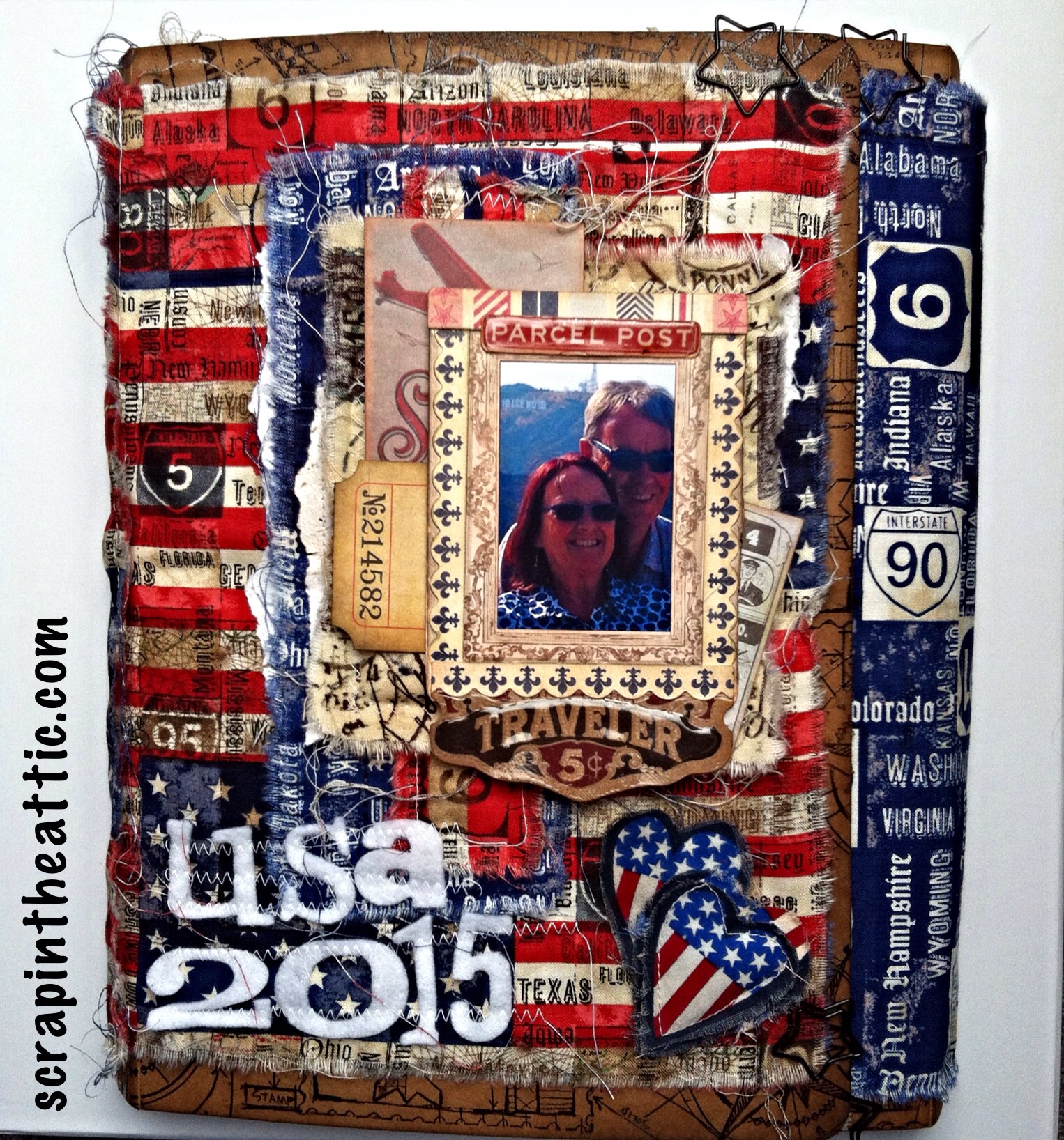
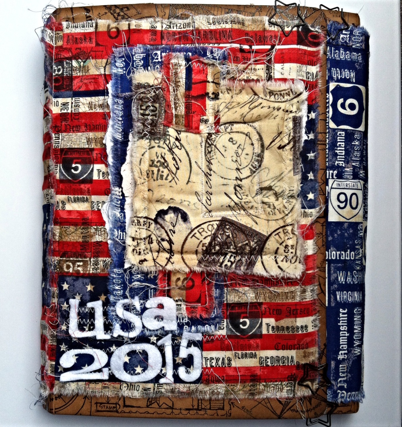
Graphic45 A Christmas Carol

Posted on

I was so pleased to receive my parcel from Jones and found the new Graphic45 A Christmas Carol papers plus the Patterns and Solids.
I am so excited being on their Design Team!
These are the creations I made……

image

I wanted to create the story of Bob Marley going home on Christmas Eve with his small son in the snow. The wall hung house shaped box was from Tiger, painted black and then decorated with papers and fussy cuts.
Here is a side view.

image

The Christmas card started as a patchwork arrangement of papers and cutaparts. The card is 8×8 inches square.

image

I used TH die cuts to make the film strip and the rosette.

image

In side the card a cutapart fitted perfectly.

image

This memory box started as a £2 hinged box from The Works. I painted it black and then added the papers. The berries are highlighted with Glossy Accents, the flowers have Stickles and there are hints of Treasure Gold for added sparkle.
Well it is for Christmas!
I made a strap with a magnetic closure using TH label die cut, a fastener from 7 Gypsies and magnetic tape.

hope you like them, more will be added as I go along!

hugs

jan x


Autumn Colours

Posted on

The new September Challenge over at Our Creative Corner is from Julia,
image

She says, I love the colours of autumn! Those beautiful and dramatic reds, golds, yellows, browns, greens and all shades in between. Your challenge this month is to take some inspiration from the colours in the image provided and make an autumnal inspired project.


photo (44)


I really enjoy walks through the woods with my family. This photo was from a fun day out at Centre Parcs, Woburn. My Granddaughter loved to balance on the fallen tree trunks! This is how I created the page for my scrapbook.

image
First I made a sheet of Autumn colours for my leaves. I used wrinkle free distress technique with Distress Inks.

image

I used TH Tattered Leaves die and embossing folder, then gave the leaves some Vintage Photo and Treasure Gold for a sparkle of Autumn sun. I used Cor’dinations Metal paper in gold to make extra leaves.

image

I marked where my matted photo would go on a 12×12 sheet of scrapbook paper from my stash. I built up layers of stencilled leaves, first Distress Inks in shades of green and brown then tinted Grunge Paste to add depth. I was working on a pile of wind blown leaves effect! I put some splatters and spray on top.

image

I wanted some textures to give an Autumnal feel so hessian ribbon was attached with eyelets so give more flexibility. I tried various ribbons through the eyelets but eventually tied some textured thick wool which had the colours of our jackets threaded in the black.

image

I matted the photo onto card and then created a wood effect layer to add the title. I did this by dragging Walnut DI across the kraft card and then ruled lines to make planks, it looks effective.

image
The title was some chipboard letters in the same colour as the scrap paper. A quick spray of metallic gold added a sparkle. I added some stamping from Finnabair, Now is the right time, and Create magic.

We have a great prize on offer this month from……

Creative Embellishments


Creative Embellishments are offering the random prize winner a $25 voucher to spend at their store.

Happy crafting everyone, I look forward to looking at your creations

Hugs

Jan x


Don’t you chase my seagulls!

Posted on


image

We had a great holiday in LA in May with my daughter, son in law and granddaughter. Arabella spent most of her time chasing the seagulls on the beach. She was very possessive and told all the Americans ” Don’t you chase my seagulls!” Accompanied by a wagging finger, they thought it was cute luckily.

When I saw the latest challenge at A Vintage Journey, Things With Wings it brought back happy memories of Arabella on the beach. I decided to make a page for my Destinations USA Folio.

image

I began by using the mono printing layering stencil technique from CC3. I used Tim’s Flourish stencil onto textured cardstock. I made a print and then used the stencil a second time to get a shadow next to the first print but lower down. I spritzed DI markers and inked the edges with Hickory Smoke and Ground Expresso.( Arrived in the post yesterday! )

image

The TH feather die and embossing folder were perfect for seagull feathers. I cut, inked and embossed vellum but also made some blue to highlight the vellum. I created wrinkle free distress card, CC1, using the same background inks to make the feathers.

image
image
image


I made a seagull using Tim’s Caged Bird die, I cut him from white card then inked with Hickory Smoke and Ground Expresso to get the gull colour.

I cropped the photo to fit my tag and made Arabella the focal point with a thinlets die circle. The silk ribbon was coloured with the same DI. I added the new plane charm because Arabella was so excited to have flown to LA. I coloured the plane with Faded Jeans alcohol ink.

image

The title lettering was a very old Cricut alphabet die from my stash!

This was such a fun page to make, the Folio is filling up nicely,

Hugs

Jan x


Tag 2 for The Grand Finale!

Posted on

image

I enjoyed making my first tag for The Grand Finale, over at Linda Ledbetter’s blog so much I made a second! A huge thank you goes to Linda and the DT for the Challenges and inspiration, I have had fun joining in And learned a lot.
I used Tim Holtz Layered Stencil Monoprint technique. You need to read the instructions in his book, CC3.
There are fabulous prizes from Tim and Mario and The Funkie Junkie Boutique.

image

I used DI with an Andy Skinner stencil I have just bought that fitted my travel theme. I used watercolour paper this time to get a patchy effect. I used the stencil as a template to outline some of the letters and numbers.

image

Hickory Smoke DI made a great edge, love how that colour compliments the other new colours this year. I used a Prima compass stamp and a Tim corner stamp to enhance the Travel work and make it pop.
A drop shadow folder links the two tags but this time I used tracing paper and made it into a belly band. I can add tickets when it is in place in my Destinations Folio.

Hope you like Tag2
Hugs
Jan x


Destinations Tag for The Grand Finale!

Posted on

image

I am really enjoying making my Destinations Folio about our trip to the USA. I am working on our time at Hermosa Beach, LA, which we spent with my Granddaughter. I made this tag to fit between photo pages and souvenirs.

The background is a Layered Stencil Monoprint technique. I am entering Linda Ledbetter’s CC3 Challenge 34, The Grand Finale, so you will need to find your copy of Tim Holtz book for the instructions!
This is the stencil and DI used for the technique.

image

I stamped some Blueprints with Black Archival, clear heat embossed and inked the images. I created the drop shadow using an inked embossing folder, Tim’s new tool certainly makes that much easier!

image

I cut a strip out to create a pocket for journalling tags, I stuck some tissue tape on the edge to strengthen it and inked with Hickory Smoke. A bit of faux stitching finished the tag. I dyed silk ribbon with Abandoned Coral and Fossilized Amber and tied in a loose bow before adding a compass charm.


I can’t believe this is the last challenge from the book, I have loved the creative journey through the book and the inspiration from the DT, thanks everyone. I hope to win an awesome prize from Tim and Mario or  the generous sponsor The Funkie Junkie.


hugs

jan x


Masks for The Mirror Crack’d Challenge

Posted on

image

Welcome to our August Challenge at The Mirror Crack’d.

Our theme for this month is Masks, they can be Theatrical Masks, Stencils or Mask Techniques.

Susanne is our host for this challenge who will be choosing our Winner and Top 5

We are thrilled to be sponsored by
WOODWARE CRAFT COLLECTION

With a prize of £12.00 to spend at your favourite Woodware Stockist, either in store or on line.

Check out the amazing inspiration from our team at The Mirror Crack’d.

I decided to play with Mask Techniques for my DT creation. I wanted a focal point for a Pocket Page to put in my Destinations Folio.

image

I chose this supercool new stamp from Paperartsy Hot Picks. I used a bright blue Archival to stamp once onto the card then again onto thin post it stamp paper for the mask. The next step is to cut out the mask – when the ink is dry!

image

The mask was gently stuck over the image using the post it adhesive strip. I inked over the card with Distress Inks. When you ink over the mask work from the center to the sides. Underneath is clean and white.

image

The next Mask Technique is using a Layering Stencil ( some call stencils masks) and clear embossing powder. I pushed a mini embossing ink through the stencil rays, having trapped the paper mask underneath. Remove the stencil and masks, then cover the ink with clear embossing powder and heat set.

image

I love the shine of the rays. I used 2 Distress Inks over the embossed rays, make sure you have the mask in place too. Gently use a baby wipe to take extra ink off the rays.

image

Nearly finished! I added some chit chat words I snipped and inked with archival blue.

imageI hope you are inspired to play along with us! I am looking forward to seeing your creations.

Hugs

Jan x


Mexico Moods for Our Creative Corner

Posted on

image

Hi Everyone

This is the summer challenge from Our Creative Corner

image

We want you to grab any inspiration you like from these wonderfully exotic photographs…

image

Go for colours, shapes, textures, objects or style – There is certainly plenty of inspiration to choose from here in this selection of glorious, vivid, colourful photographs.

Join us in the summer holiday mood….!!!
I was inspired by the cacti on the mood board when I found this photo if my husband at the Grand Canyon, Nevada. We had an amazing helicopter ride right down into the canyon and this was the champagne stop!
There were lots of cacti and lizards to snap, the colour of the sky is awesome and matched his  tshirt.


image

I chose a white, linen effect 12×12 paper. Then out came my Dylusions sprays. However the spray was too harsh, I was looking for a more splattered, delicate effect. I tried blowing blobs of ink through a straw but I wasn’t happy with that. At that point I discovered I could blow the ink off the end of the tube straight onto the paper.
Just the effect I wanted!

image

These are the Dylusions colours I used, taken from the mood board and to fit the landscape and vegetation.

image

I used Tim’s new Hickory Smoke DI to stamp the landing eagle and the sentiment, I like the faded effect. A strip of film strip ribbon finished the page. (Sorry it’s a bad photo, the stamps are clear and the packaging is old!) The letters were die cut from black card using a TH Bigz die.

I wanted a clean, simple look to make the colours pop off the page.

Now it’s your turn, you have until the end of August to join our challenge! Check out the Design Team inspiration they have created some beautiful items for you to look at.

Our generous sponsors have some great prizes on offer…..


image


image

Hugs

Jan x


Destination USA

Posted on

image

We had such a fab holiday in the USA in May. We did a Road Trip around California, Arizona and Nevada. We saw some amazing and spectacular sights. I am making a TH Folio to store all our memories.

I bought fabric from Joanns and collected souvenirs, tickets and ephemera wherever we travelled.

image

This is the front cover, fabric pieces machined together with padding. I added a cabinet frame,ephemera and bits and bobs, a work in progress! I die cut letters from a TH die with white felt. I stamped black archival and clear embossed Tim’s Travel blueprints around the edges.

image

I sewed pieces onto the front to include the inside flaps. I have covered the inside with tissue paper.

image

I am entering the challenge at A Vintage Journey, the DT have created some great inspiration.

Hugs

Jan x


G45 Greenhouse Thermometer

Posted on

image

Hi Everyone
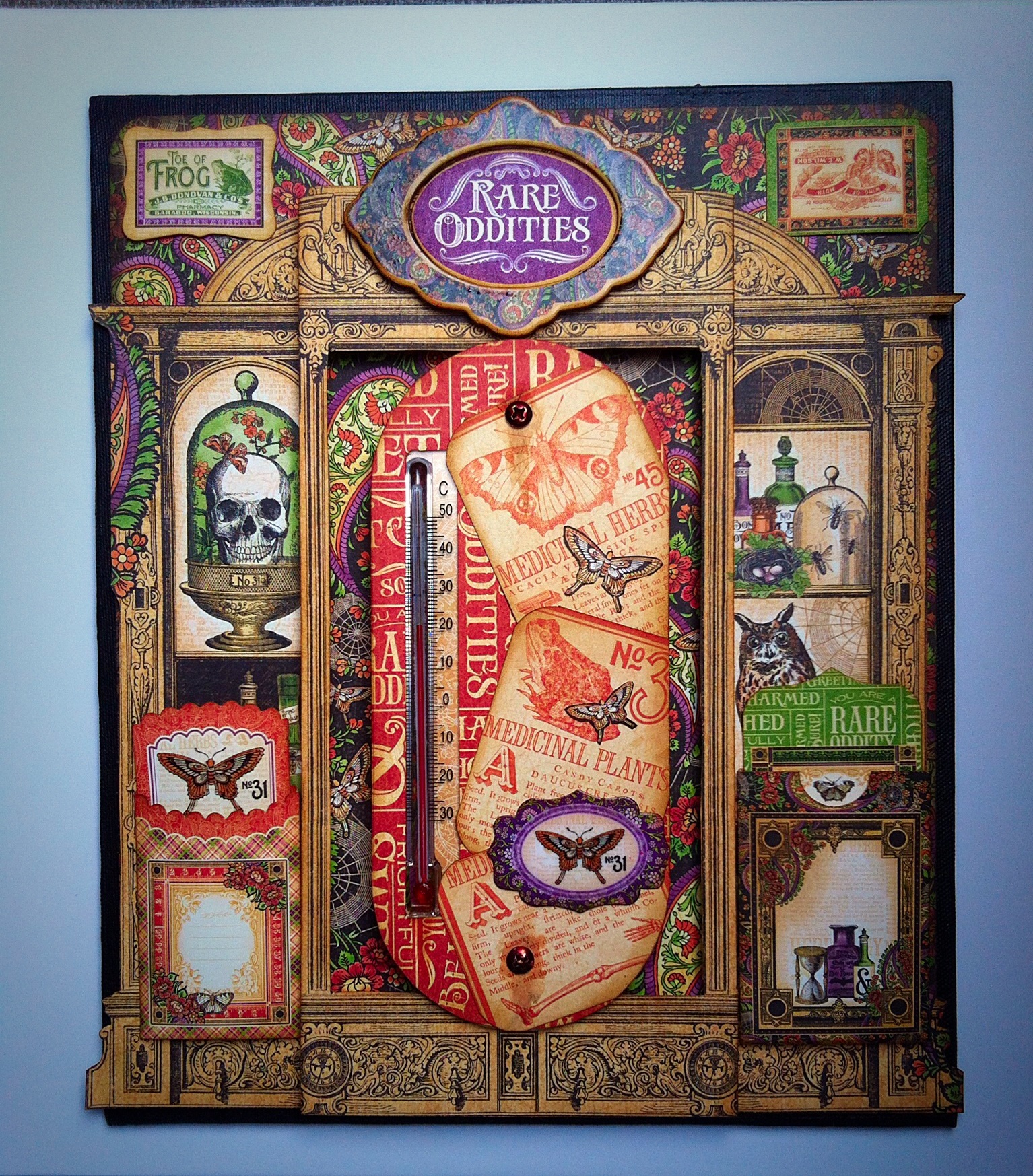
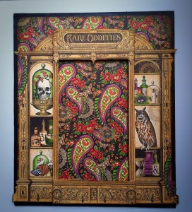
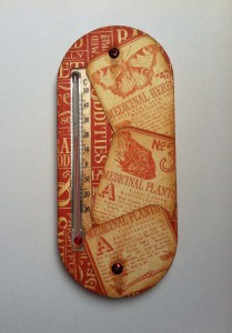
Here is my latest creation for Jones using Graphic 45 Rare Oddities Collection. This was quite a challenge as a lot of the papers in the collection are Halloween orientated and I had in mind what I wanted to make, something useful, a Greenhouse Thermometer for my husband. The papers are beautifully coordinated in colour so that once I started the mojo flowed!

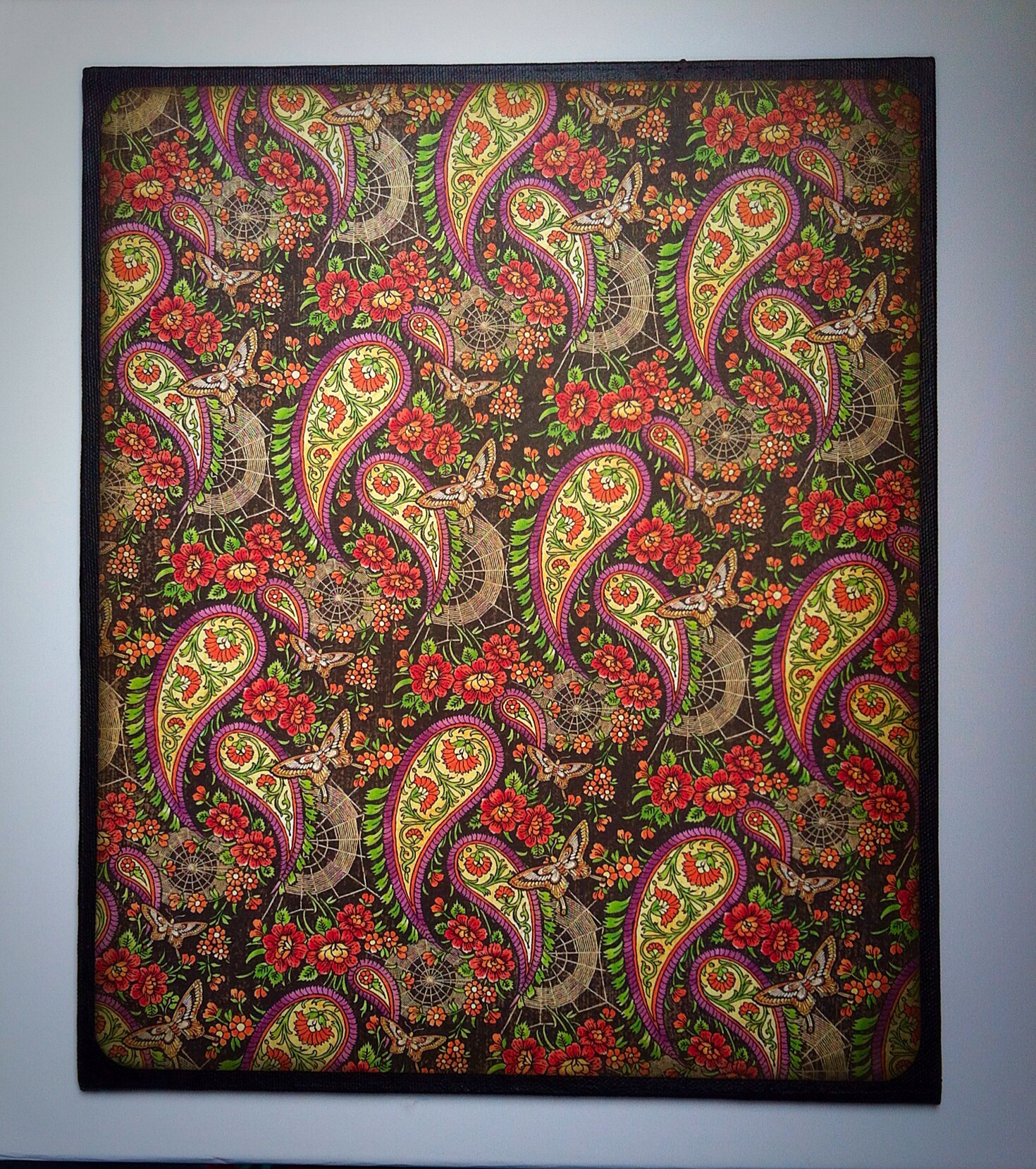
I bought a canvas board, 12 x 10 ins, for the base so I had a sturdy foundation. It had a couple of coats of black Gesso. I chose “Charmed I’m Sure” paper for the background, inked and rounded the edges after cutting it to size (11.5×9.5ins). I used a good layer of Aleene’s Fast Grab Tacky Glue to secure it and brayed over the top to ensure it stuck.

image

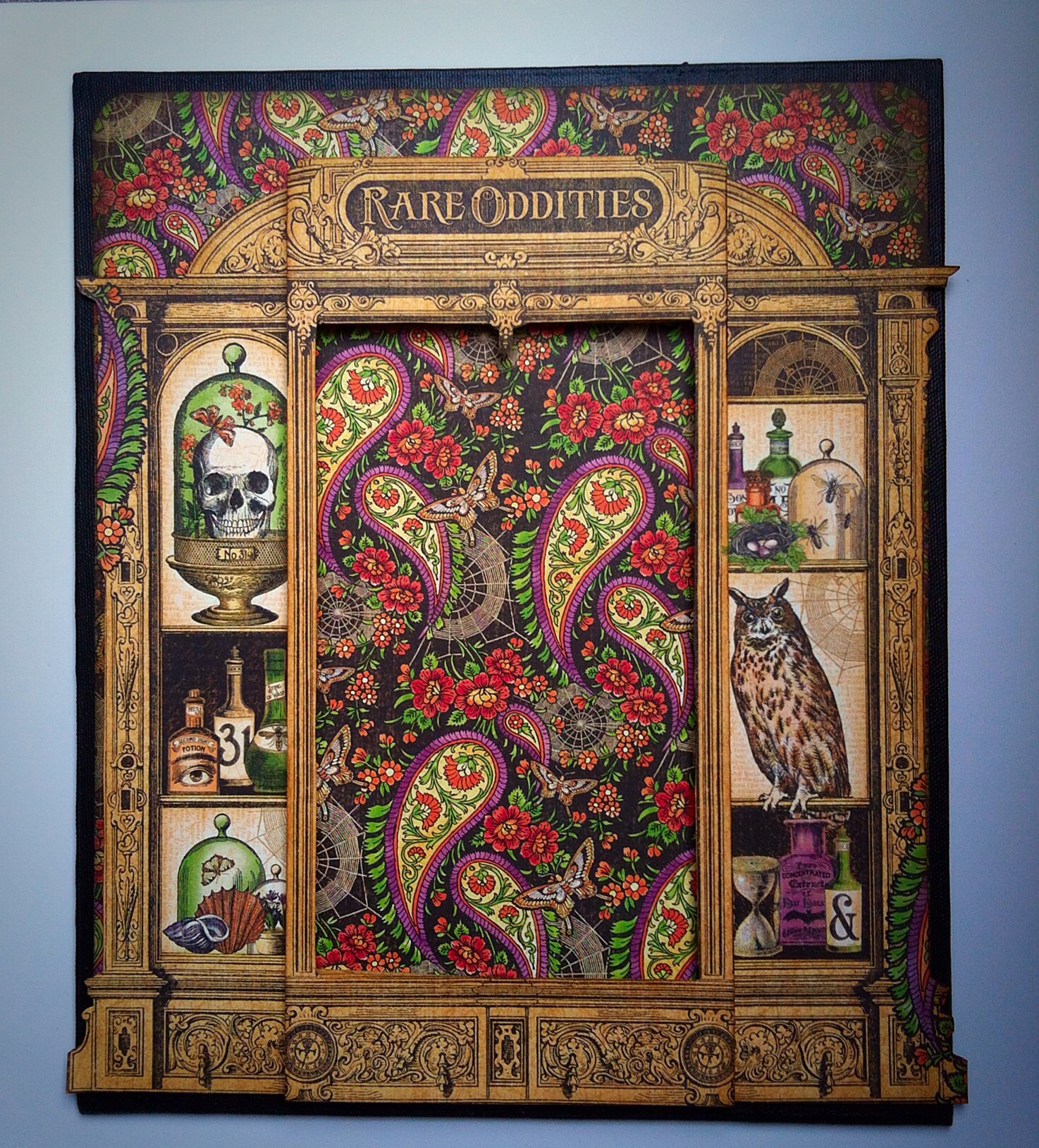
Now it gets interesting! I cut out the cabinet and central portion from “Rare Oddities” paper. Then I scored along the edge of the middle pillars, so when it was folded it fitted the background. I inked the edges of the pillars to define them, using Vintage Photo Distress Ink.

I built up a layer of old corrugated card to support the top and bottom middle sections of the cabinet. The card is not visible and a similar colour.

image

I managed to find a variety of cheap garden thermometers at The Range, they varied in price from £1.99 to 40p!
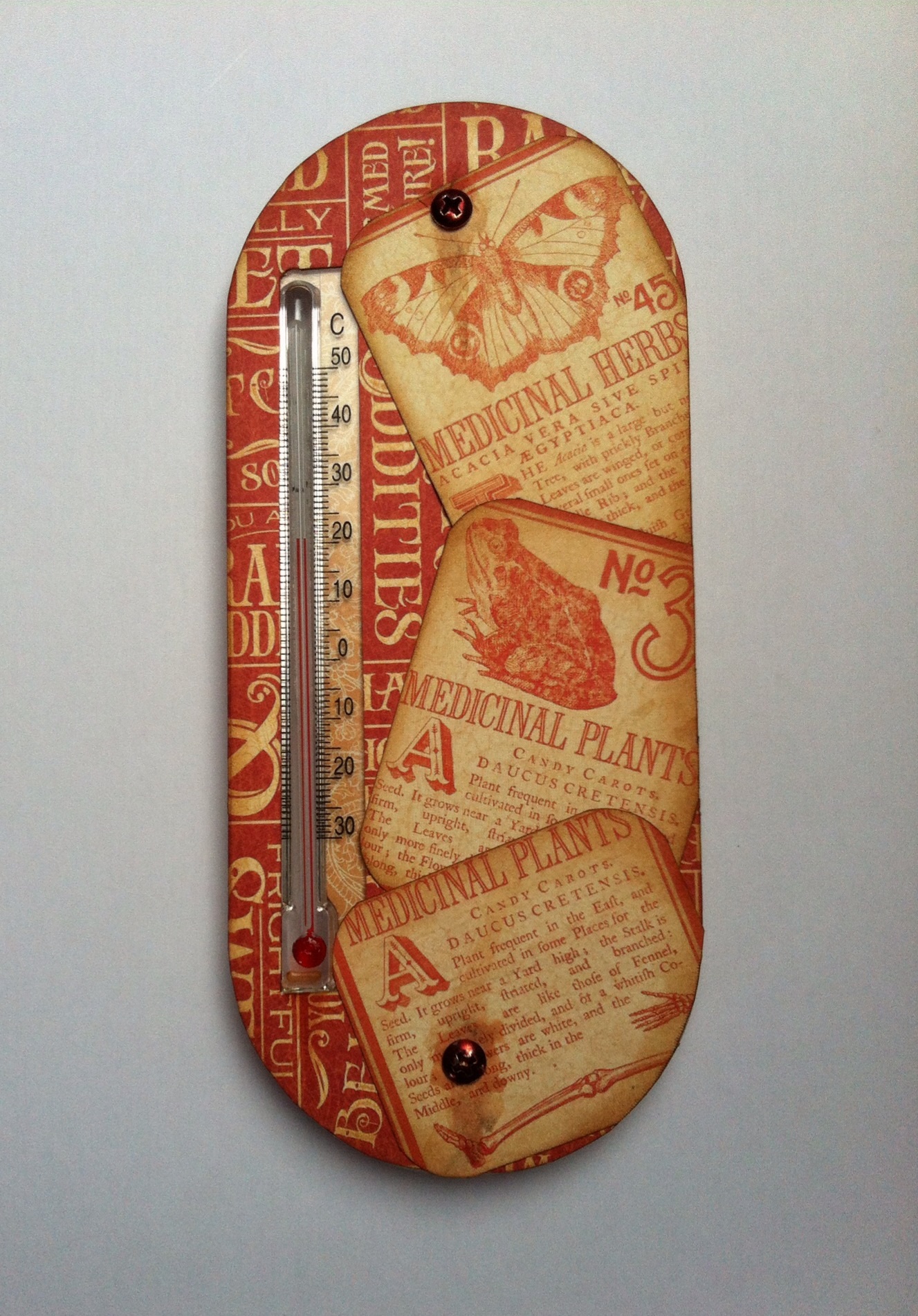
I chose a plastic, shaped one with suckers on the back as it raised the thermometer to a good height and fitted into the cupboard aperture. I covered it with “Frightfully Sweet” but it looked dull, so I cut out and layered pieces from the reverse side of the paper. I used the sections that mentioned plants. All the pieces were inked. I cut out a strip for the thermometer but it became invisible over the background. A strip of pale paper on the back sorted that problem.

image

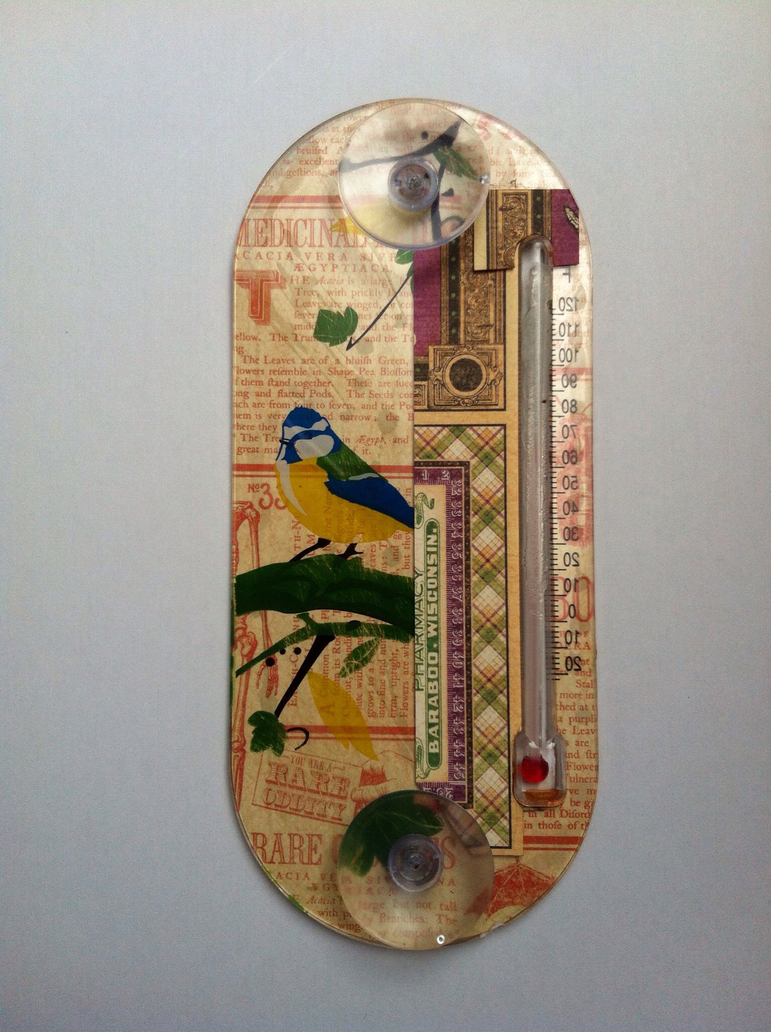
This is the back of the thermometer, you can see the patchwork pieces I used and the original bird pattern.

image

The suckers were held on with shiny, silver screws which didn’t match. They had a quick coat of DecoArt Quinacridone Gold paint, I also dribbled watered down paint to look like rust marks.

image

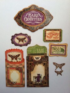
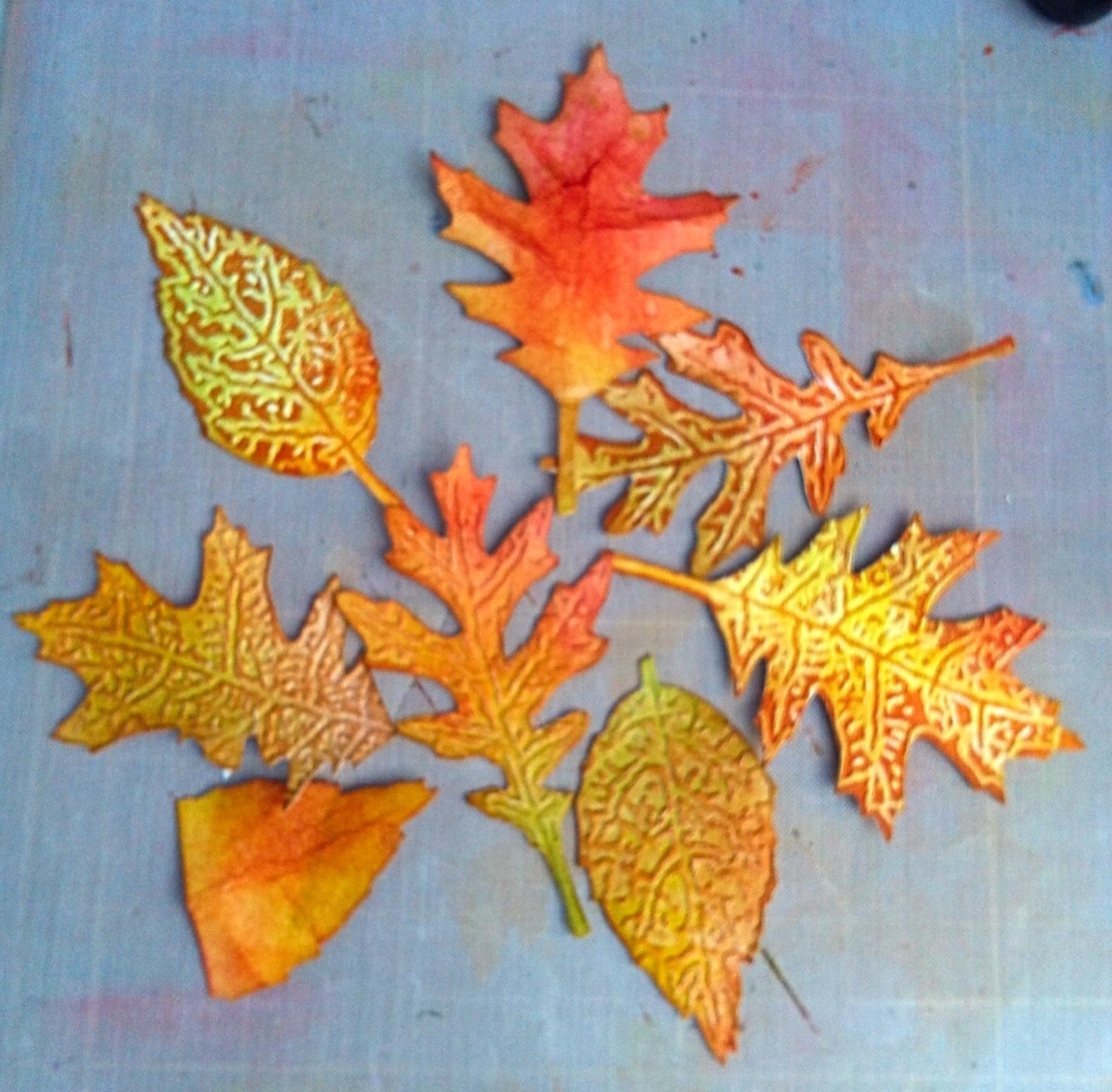
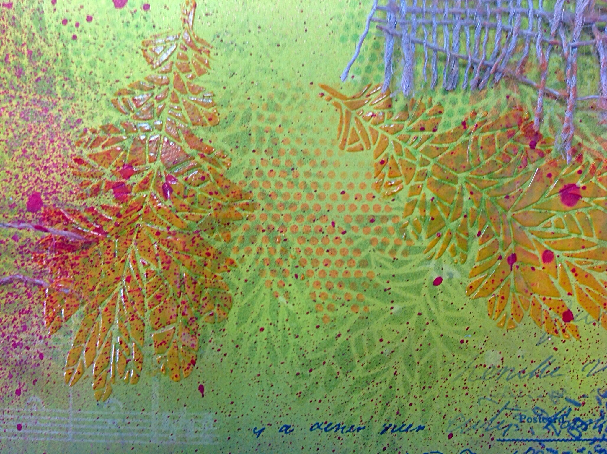
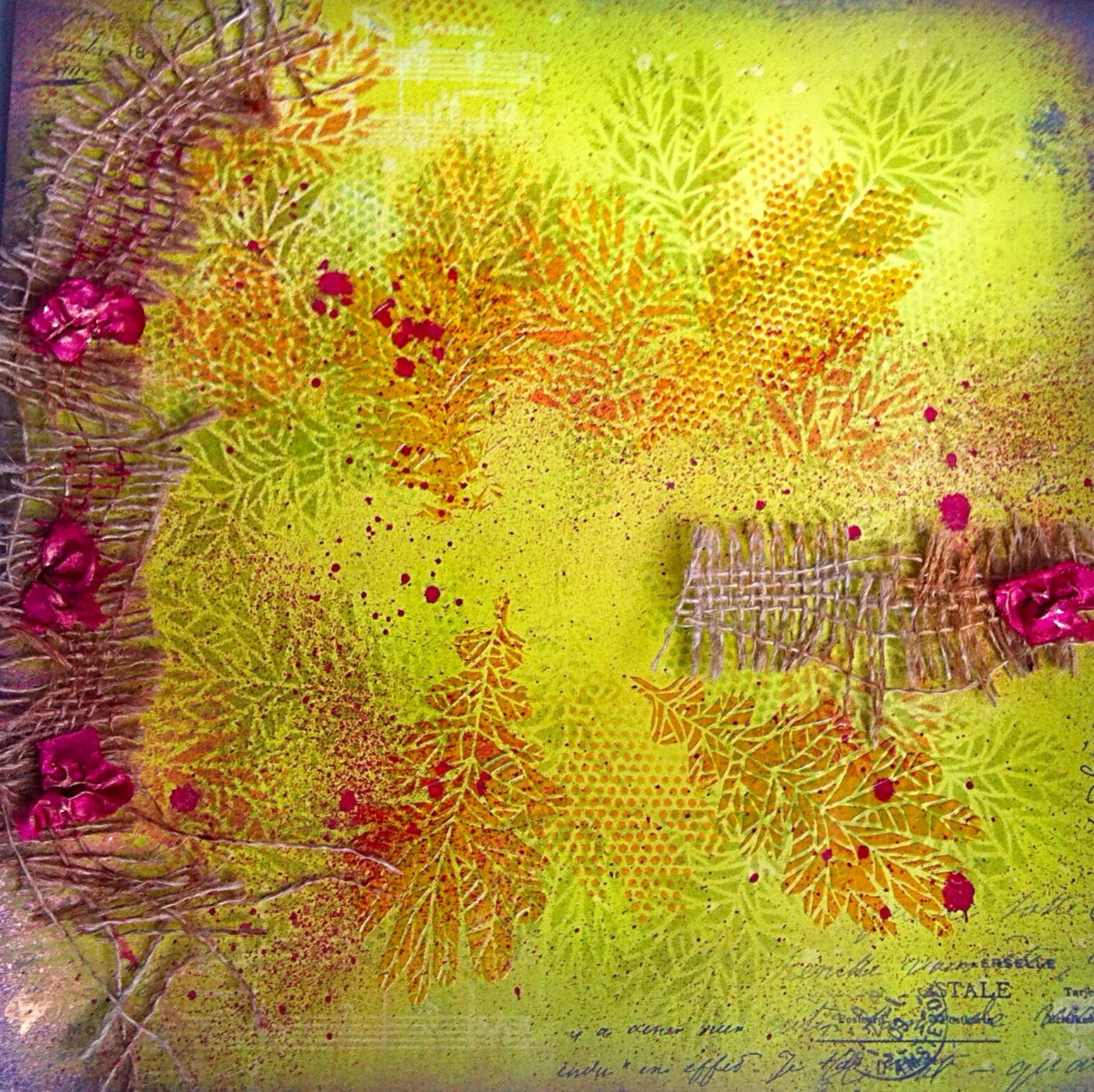
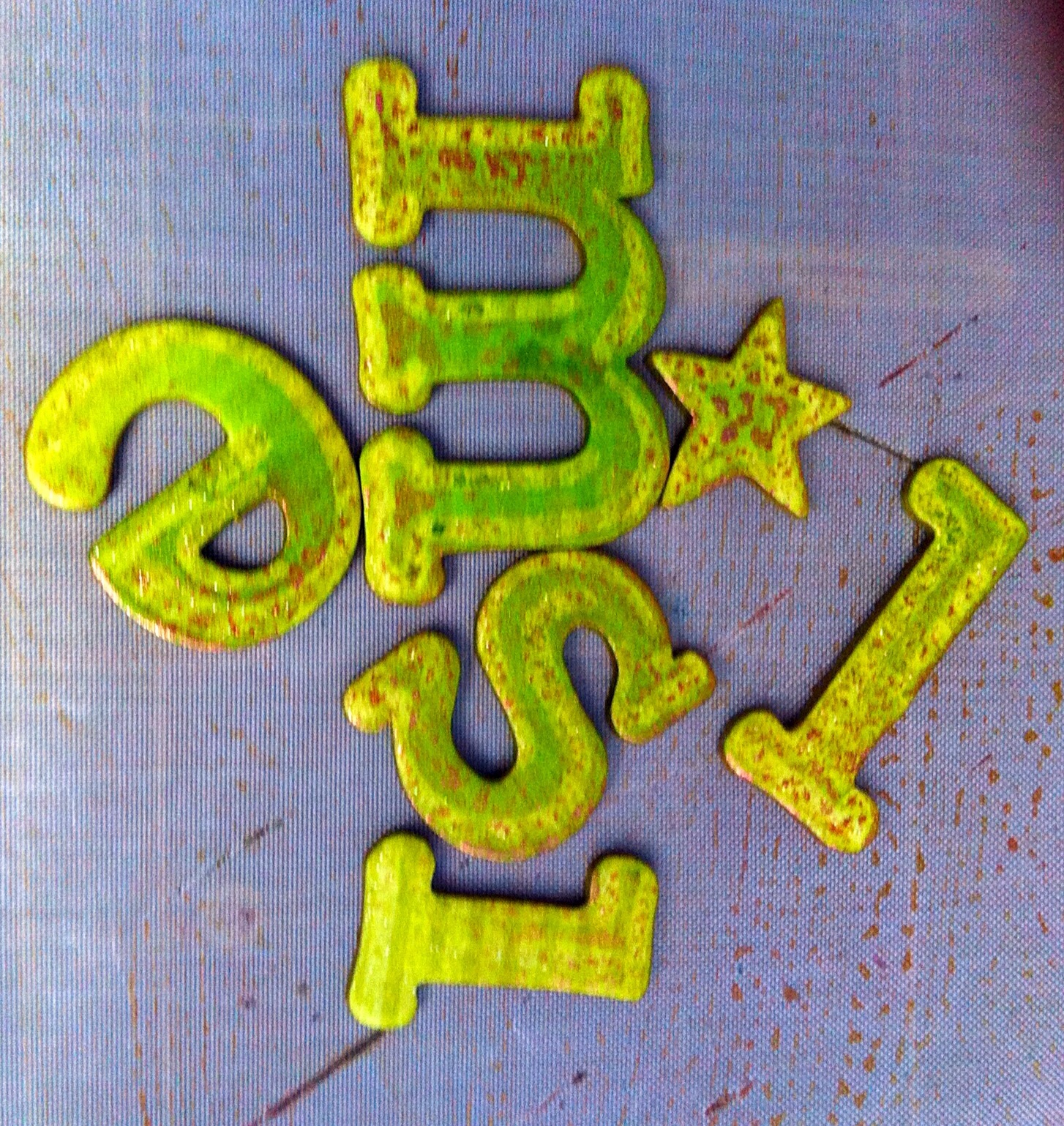
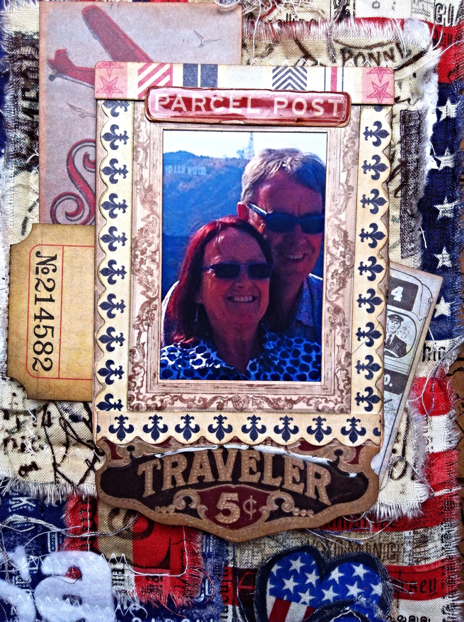
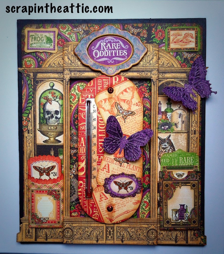
The chipboard and Cardstock die cuts in the set had so many lovely things to use I was spoilt for choice! These are the ones I chose to use. I gave the title and the butterflies a good coat of Glossy Accents, to seal and shine.

image

At this stage it still needed something else to finish it off. I took the butterfly theme and used “Brews and Potions” with Tim Holtz Butterfly Duo, die cut and texture fade. I used black archival to ink the folder before running the butterflies through. I think that gives them better definition.

image

The whole piece will be in my husbands greenhouse, so to protect it I painted a good layer of Matt Medium over the top. The envelope details were picked out when it was dry with Glossy Accents for contrast. (I thought he can keep labels in the envelopes.)
Finished!

I hope you like it and are inspired to create using these lovely papers.

Hugs
Jan x